Creo
Website design
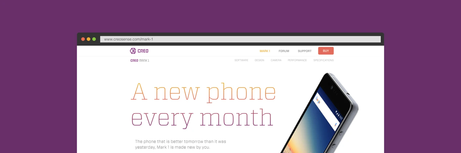
Creo is an ambitious smart devices company with a mission to create better experiences through hardware and software integration. Their first product, the Mark 1, is a smartphone that creates a unique Android experience by building features into the OS and constantly evolving it.
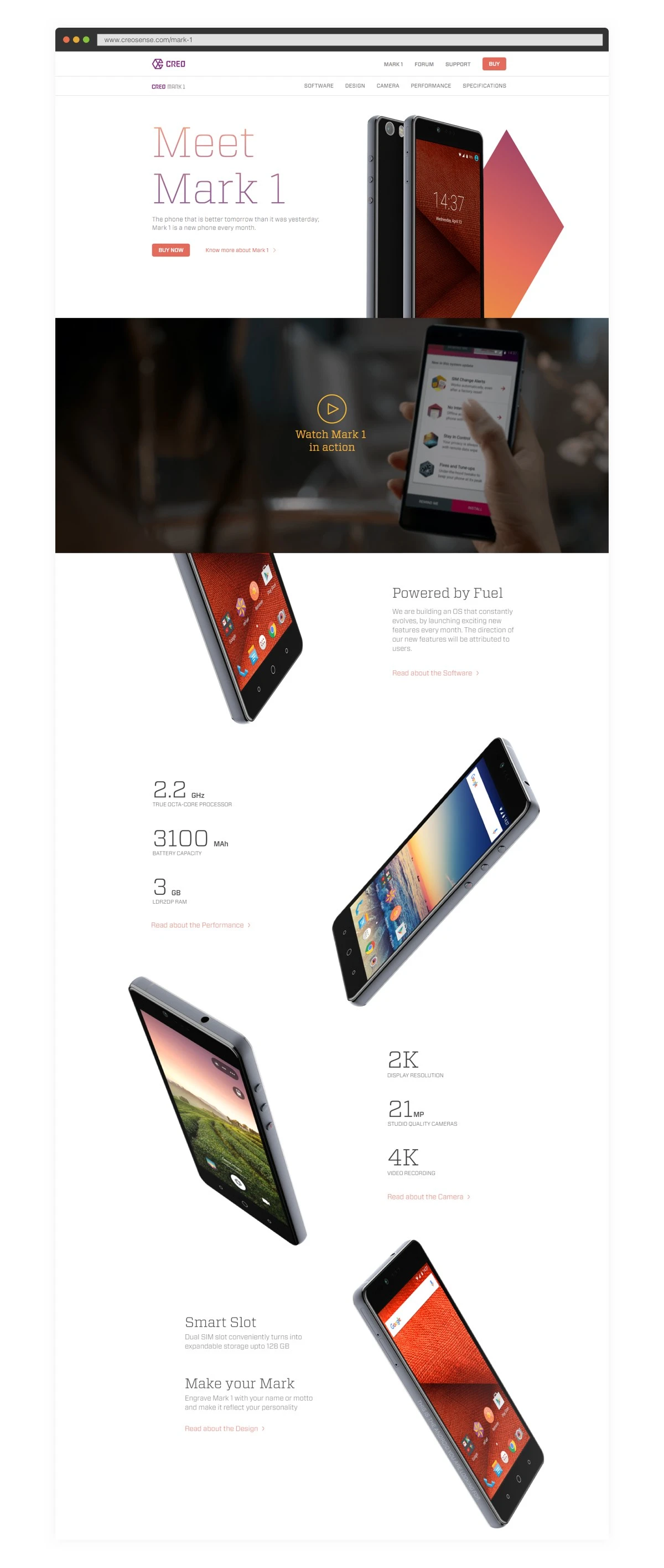
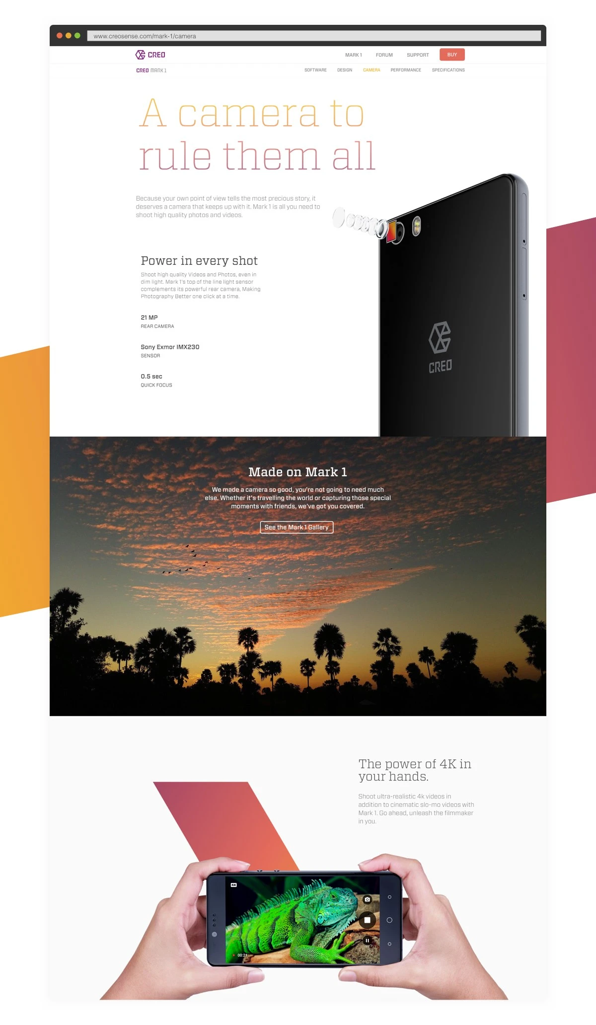
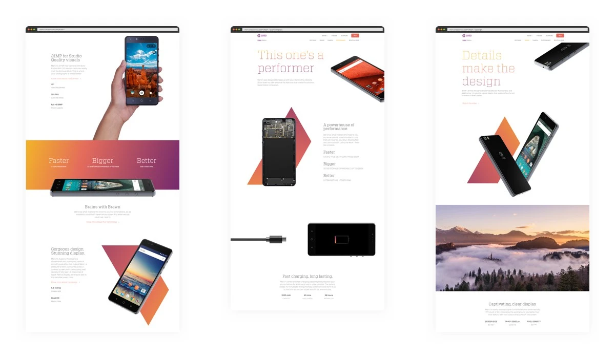
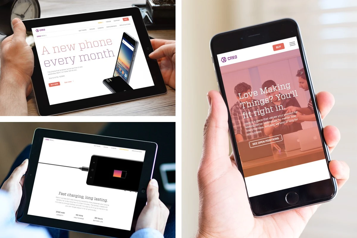
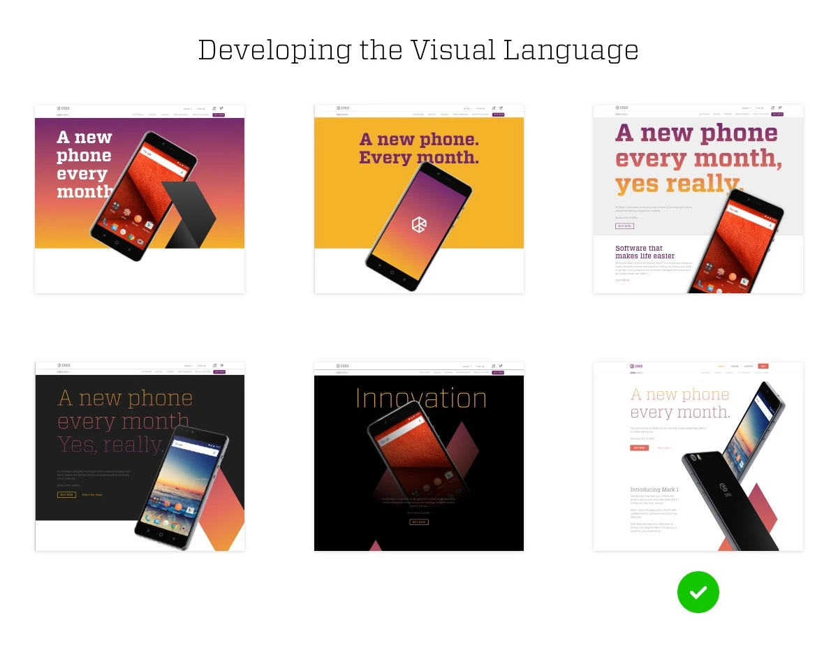
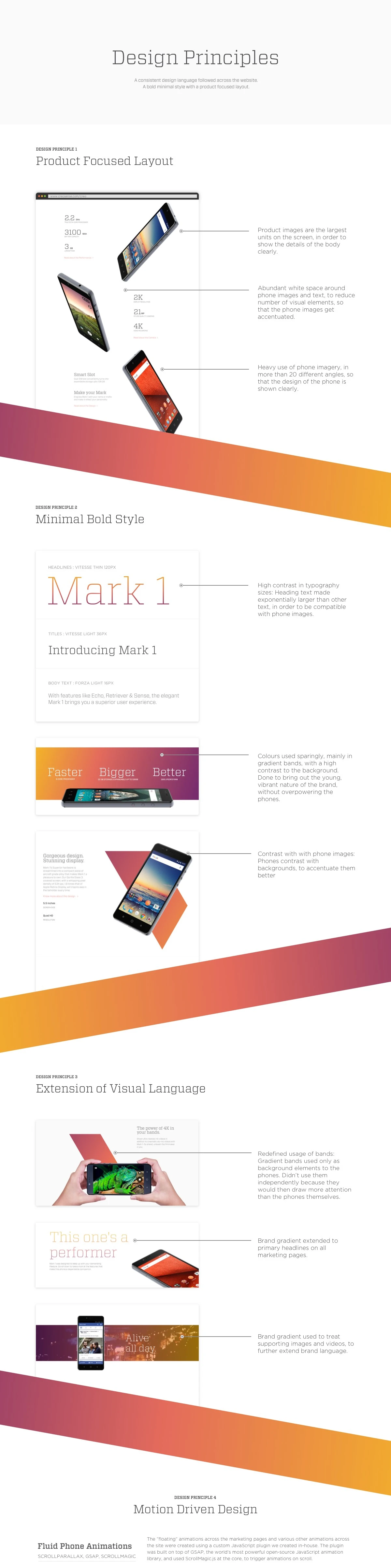
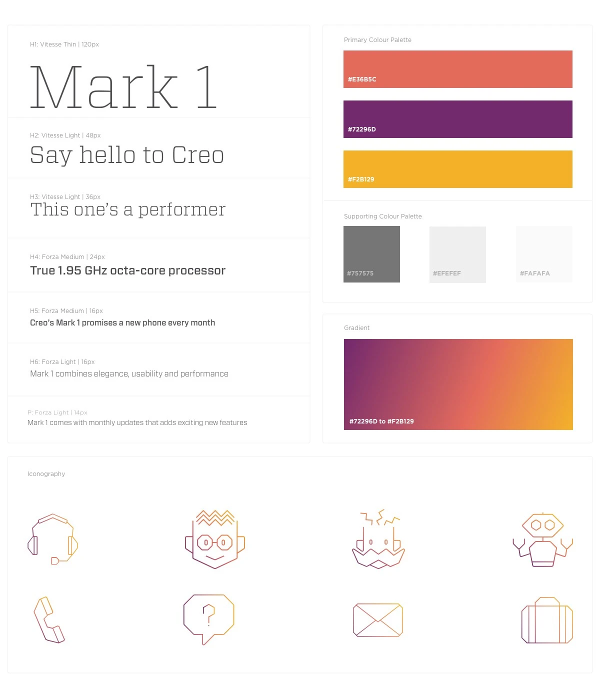
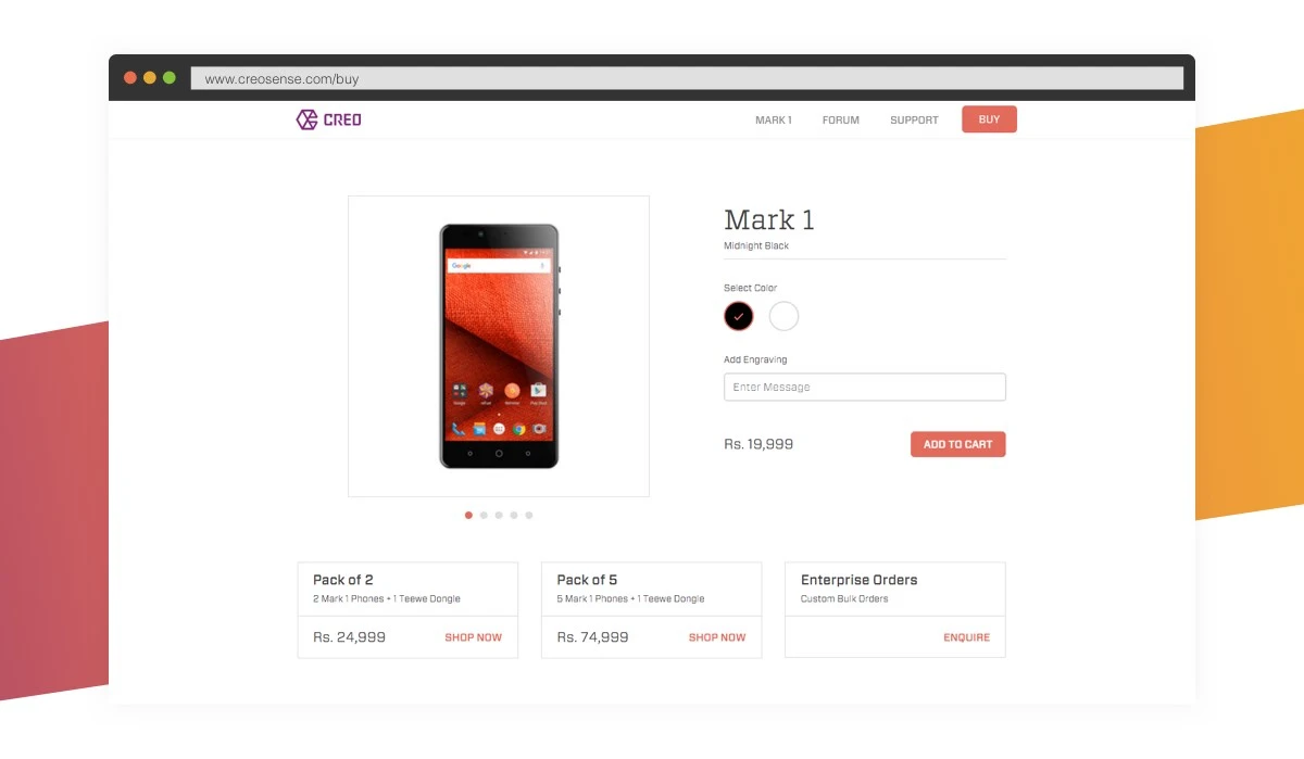
Worked with Creo to define the brand messaging (A New Phone Every Month) and build a website that allows a user to experience the product. Our role involved defining the visual language for the brand on the web, creating a set of visual principles that governed the User Experience and the design of the website. Built the website to visually reflect the cutting-edge innovation ethos of the brand and make the smartphone stand out from the dozens of Android phones in the market.
The design was brought to life in code, through advanced animation techniques (JS and CSS) that made the phones on the website “float” – moving gently as the user scrolled. The site was heavily optimized for performance – for hundreds of thousands of users, viewing it on different devices, with different levels of bandwidth.
Work done at Beard Design Studio