Haiku
Brand Design
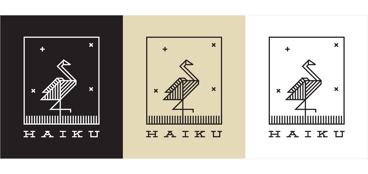
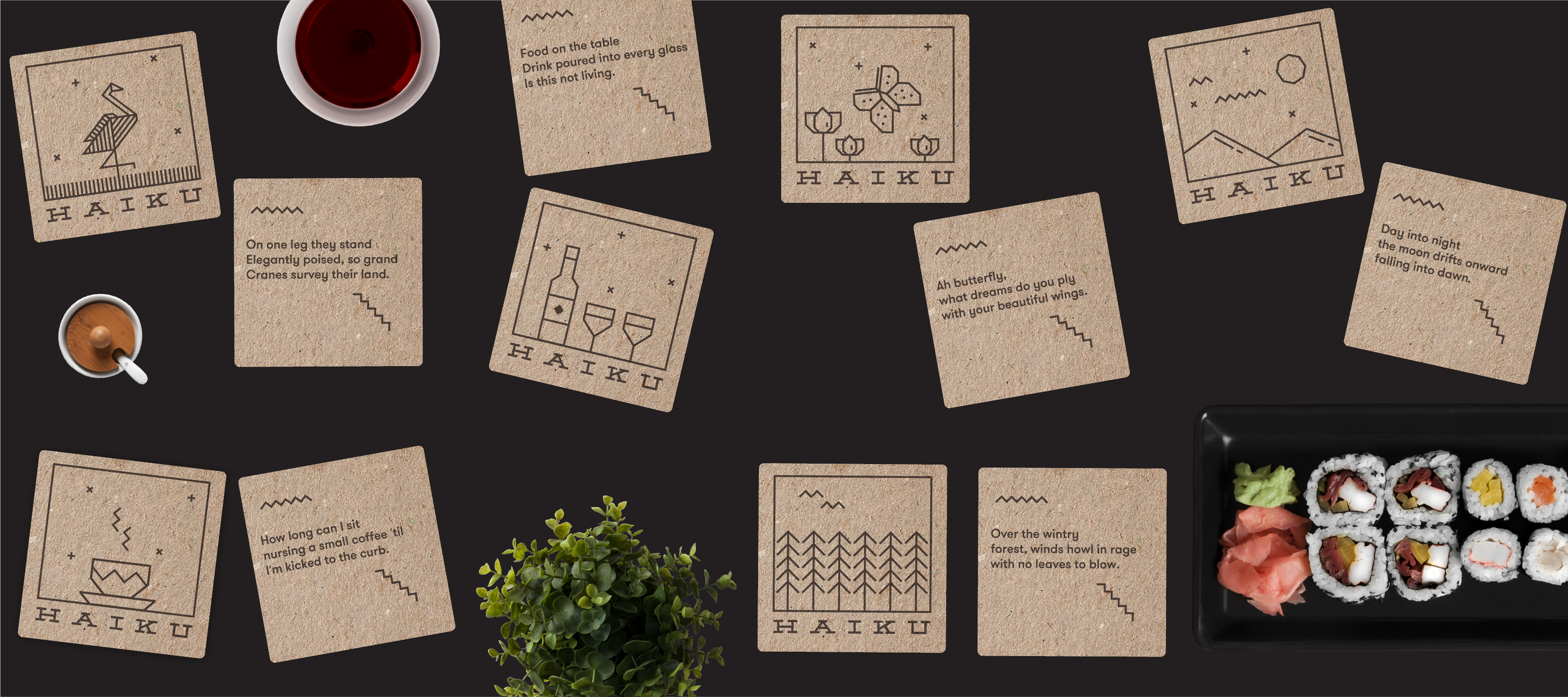
Brand identity for fine dining restaurant Inspired by Japanese short poetry, Haiku. It is highly
structured and its construction is based on the principle of 5-7-5 syllables across 3 lines. Haikus
are usually very visual in nature, typically describing a scene or observations of nature. Using
this as a starting point created an identity that uses a blank canvas to visually illustrate
a Haiku about a crane.
The entire identity and visual language have been crafted to be extremely flexible and dynamic.
The visualisation inside the canvas changes to illustrate different haikus and the proportions of
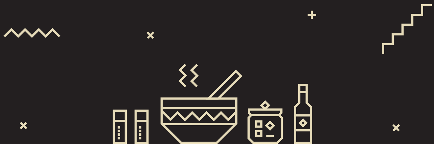
the logo fit any available space.Everything is created with 45 and 90 degree angles – no curves
or angles
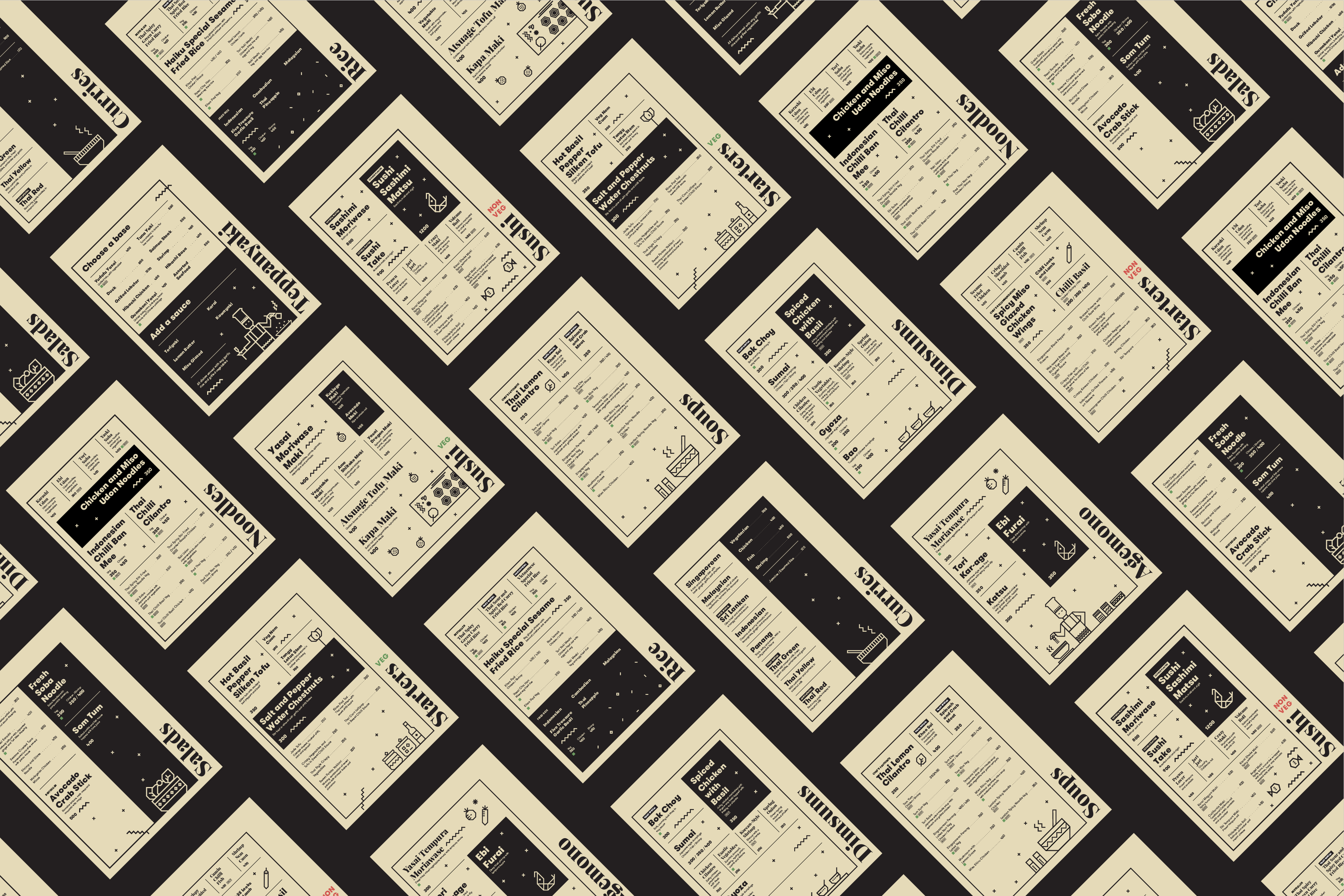
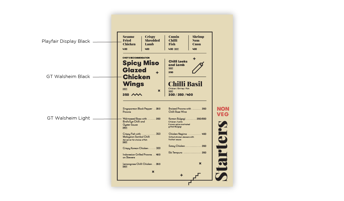
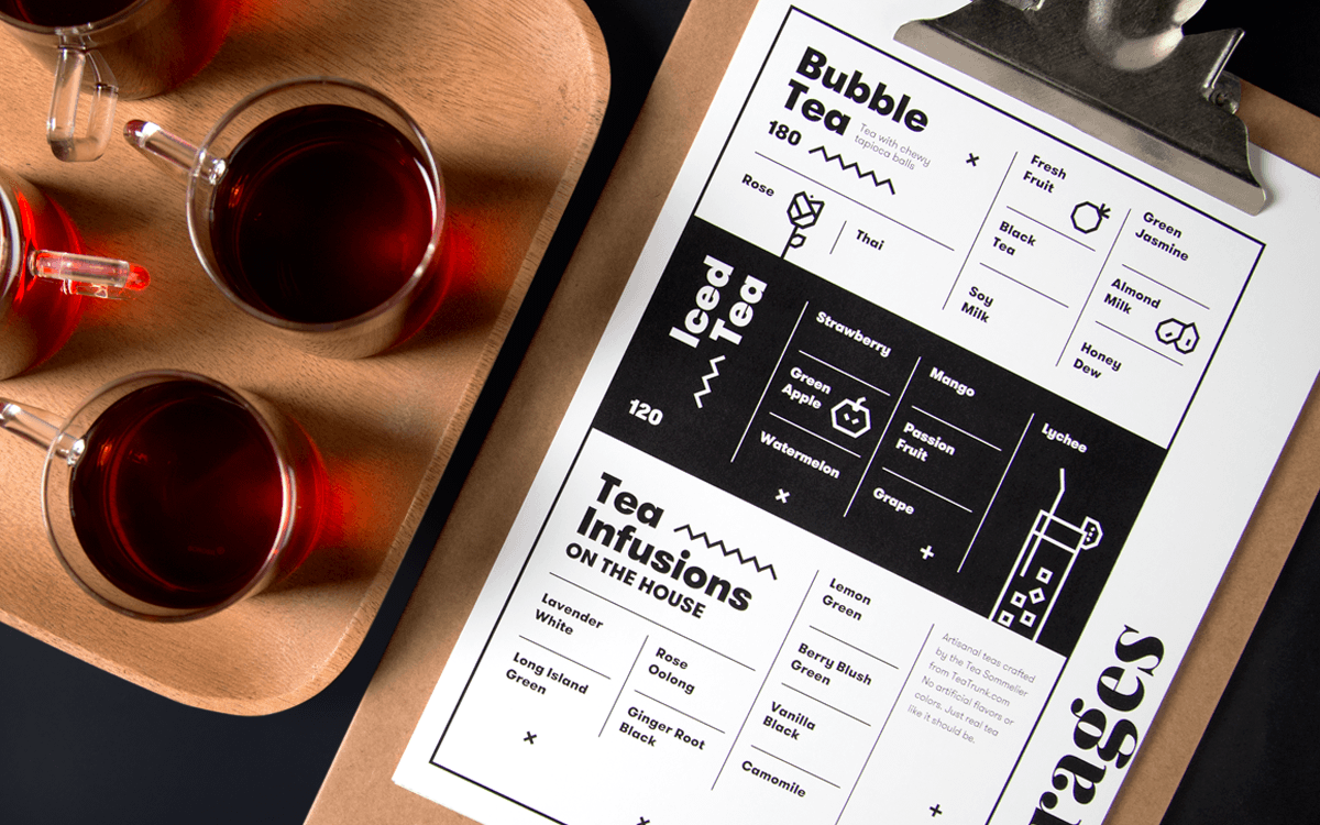
Visual language for the brand was inspired to some extent by the publishing aesthetic –
magazines and newspapers – drawing the reader in. Didn't want the menu to be a list without
any visual hierarchy. The result of this approach was a menu that is a visual treat of high
contrast typography and beautifully dense layouts.