Happy Ratio

Website design

Happy Ratio's multicolor outline illustrations of everyday objects on a dark blue background.

Happy Ratio is a new kind of food – nutritionally balanced, easy to make and tasty. Happy Ratio has the perfect balance of nutrients the body needs every day and is as simple as blending the product with 300 ml of water for 30 seconds!

The logo and visual language employ the idea of “ratios” to create a striking and memorable aesthetic that fits perfectly with the positioning “The Future of Food”. Extended the visual language to a content-dense website that beautifully explains the product, the creation story and is rich in detail for the Food Geeks and Body Hackers who want to look “Under the Hood”

Happy Ratio logo stacks the name inside rounded, multicolored capsules.
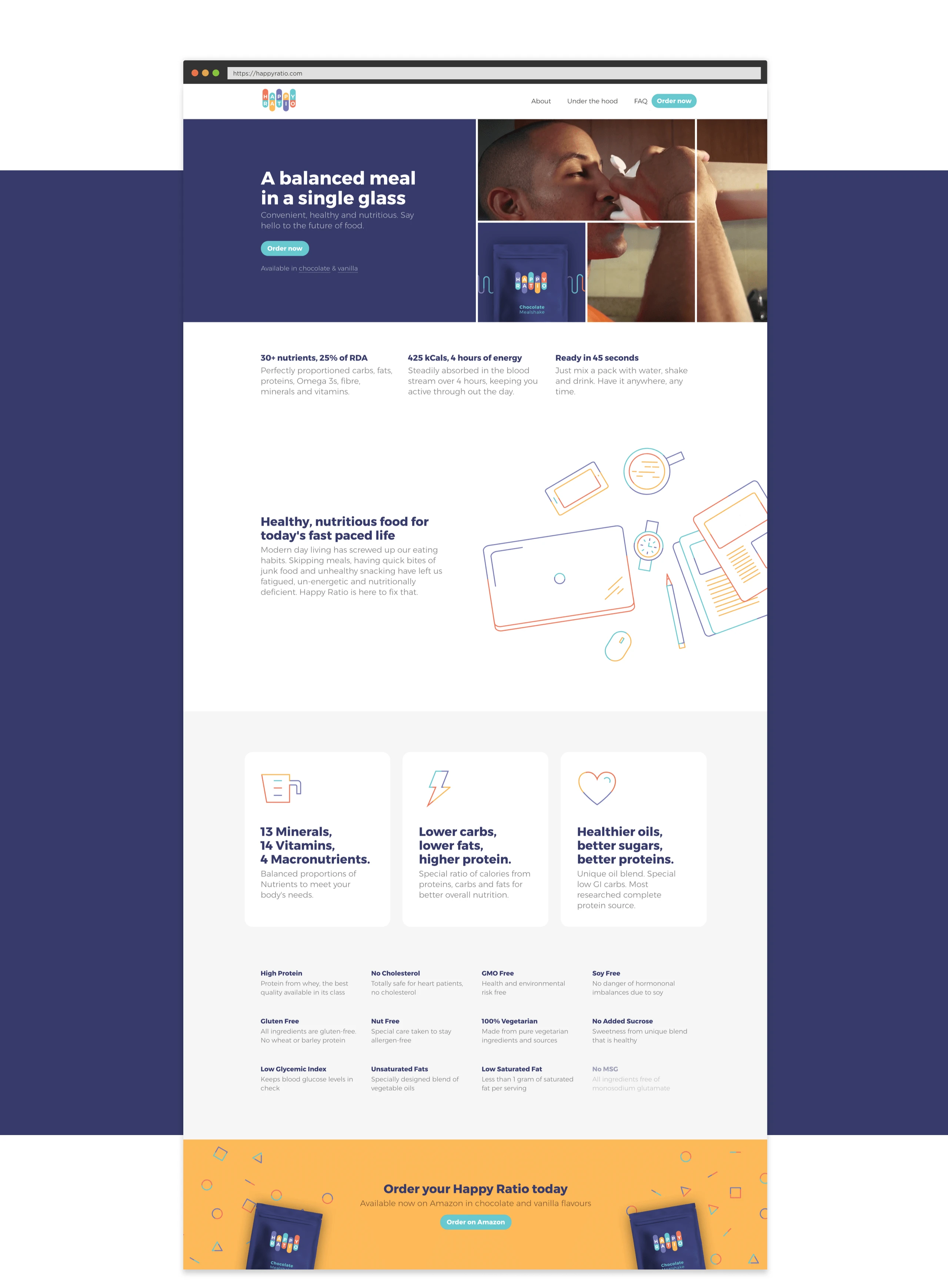
Happy Ratio home page explains the meal replacement, nutritional benefits, and ordering options.
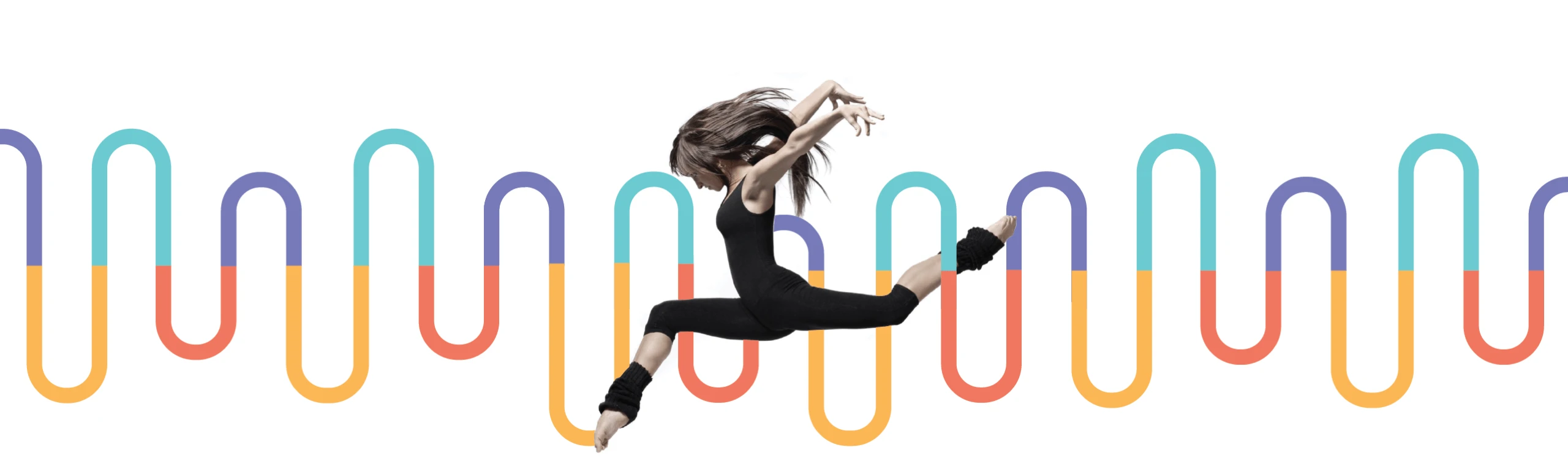
A runner crosses the looping, multicolored line motif used in Happy Ratio's visual identity.
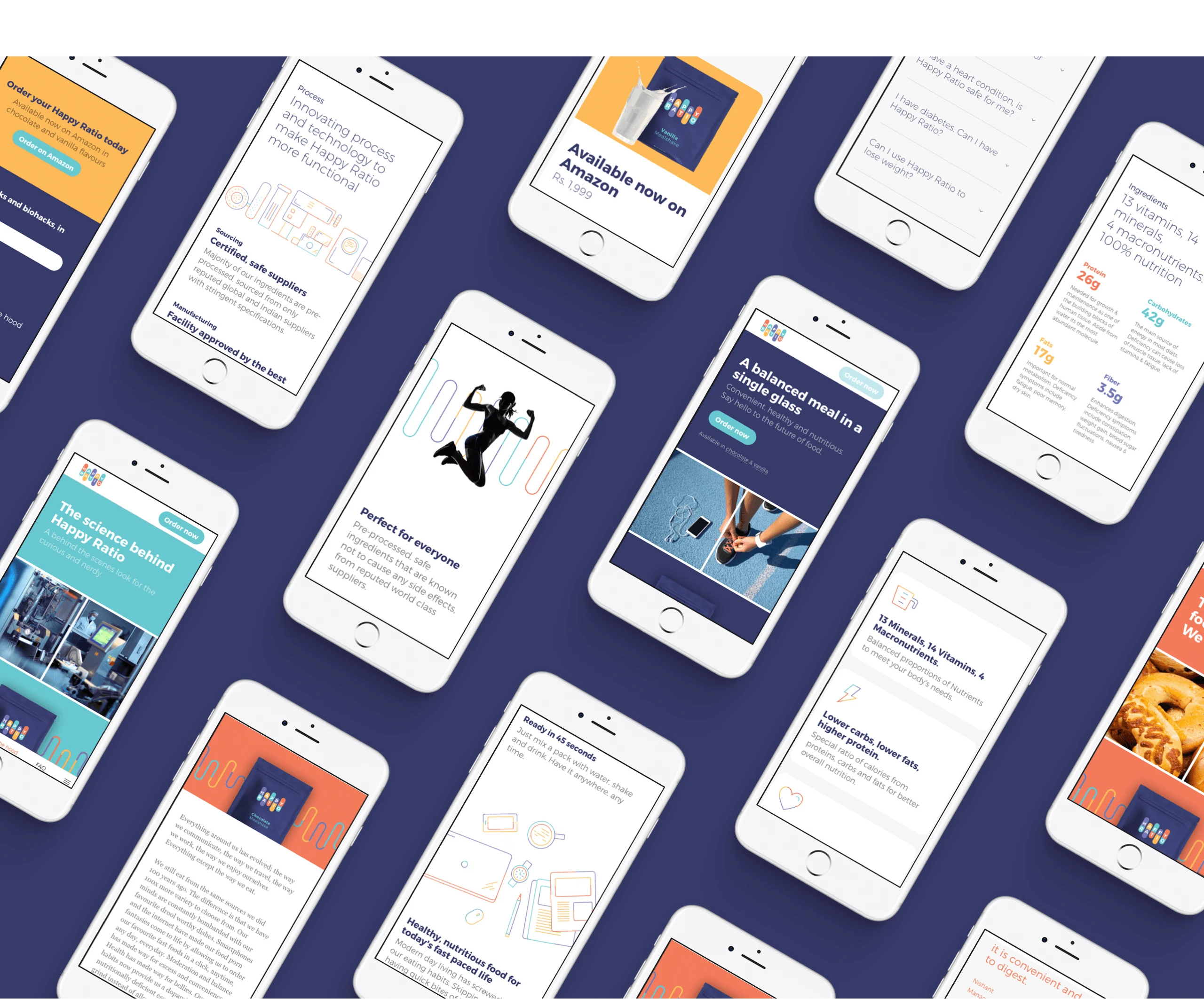
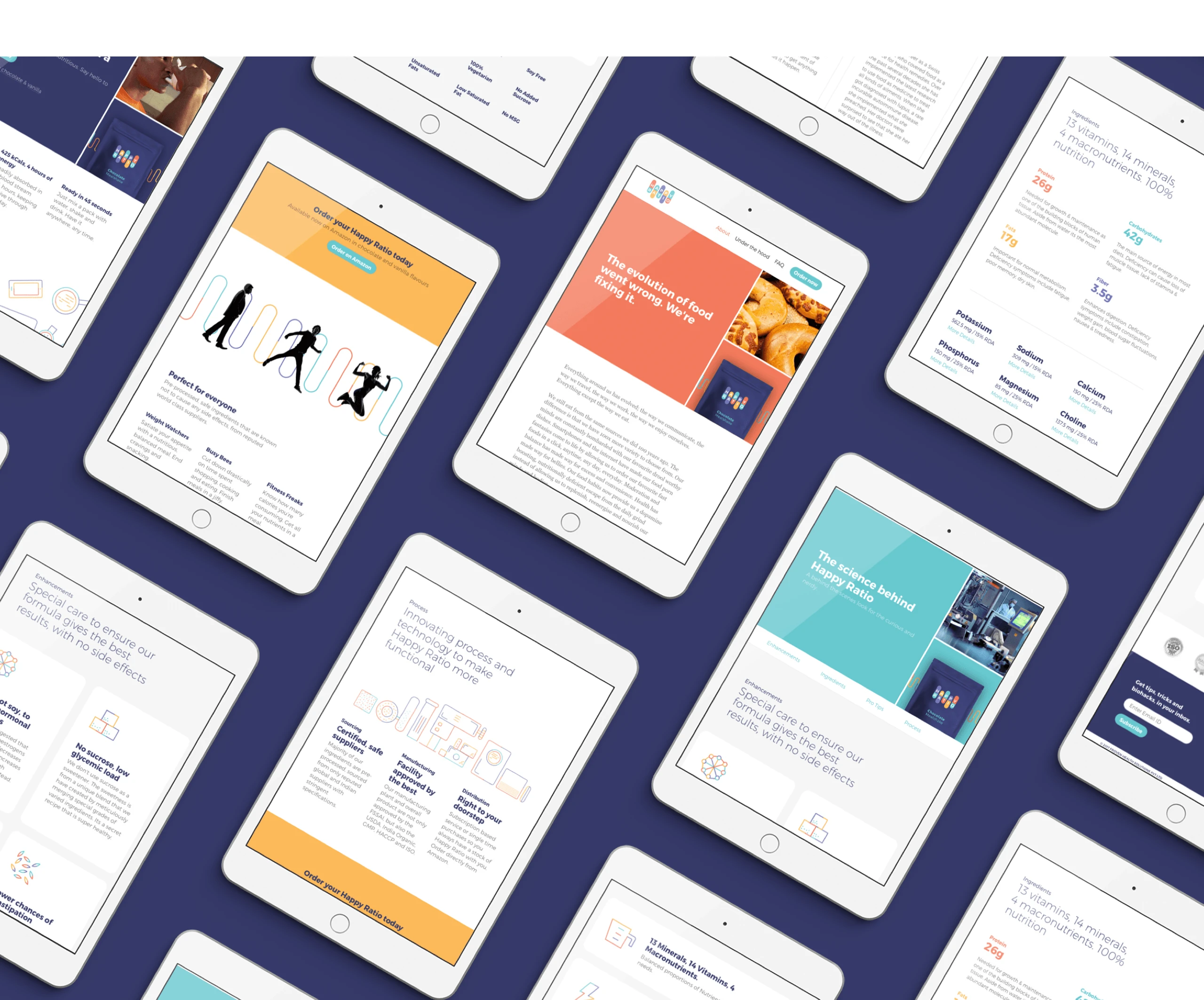
Happy Ratio website pages arranged on phone screens.
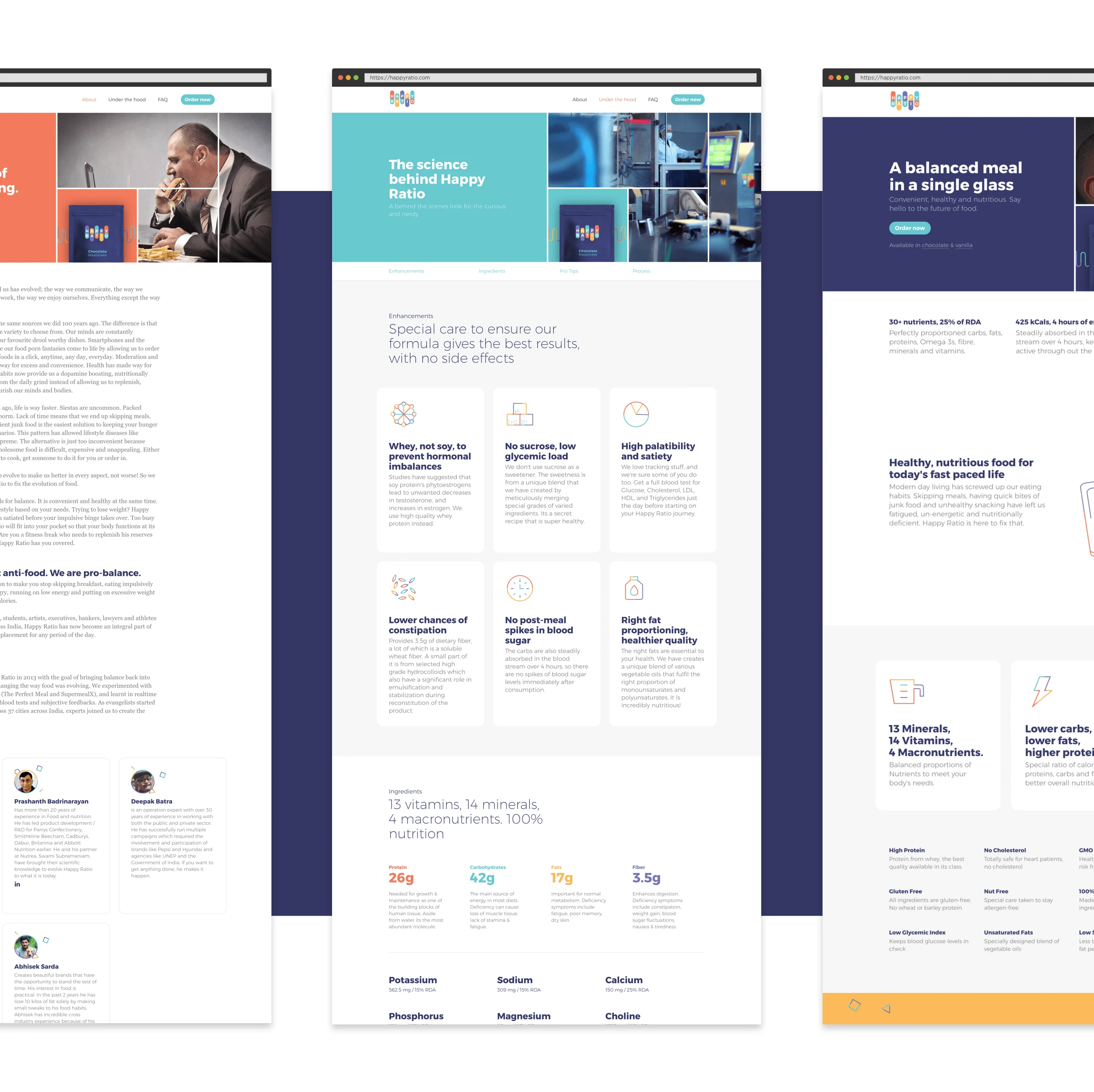
Happy Ratio desktop pages combine product information, lifestyle photography, and nutritional details.
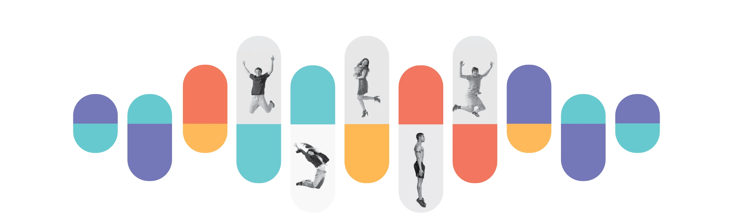
Happy Ratio's capsule-shaped brand motif incorporates active lifestyle photography.
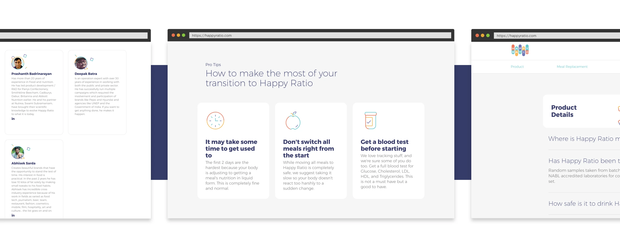
Happy Ratio pages for the team, starting the product, and frequently asked questions.
Happy Ratio's mobile layouts use compact cards and contrasting call-to-action panels.
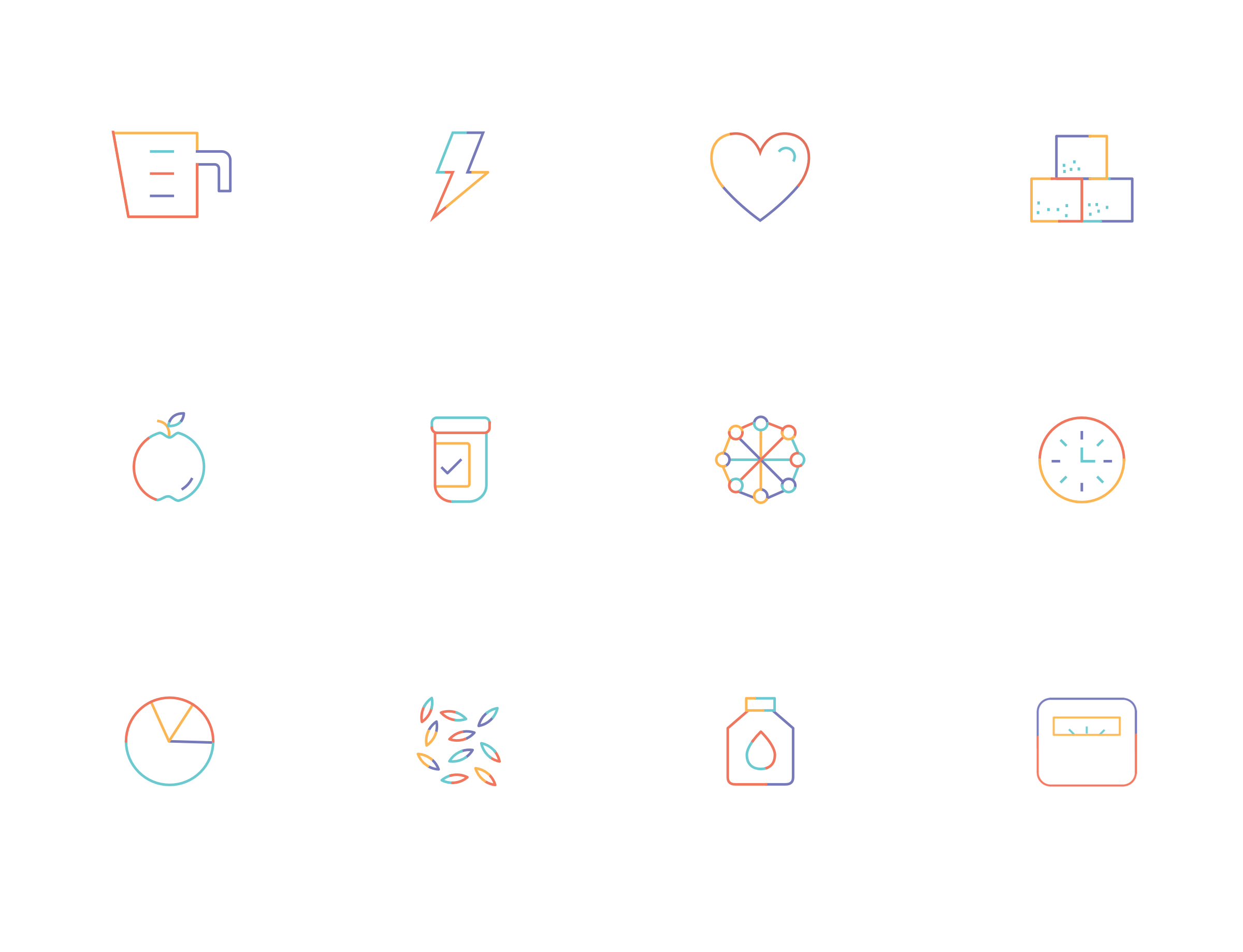
Happy Ratio's thin multicolor icons represent nutrition, energy, health, and daily routines.
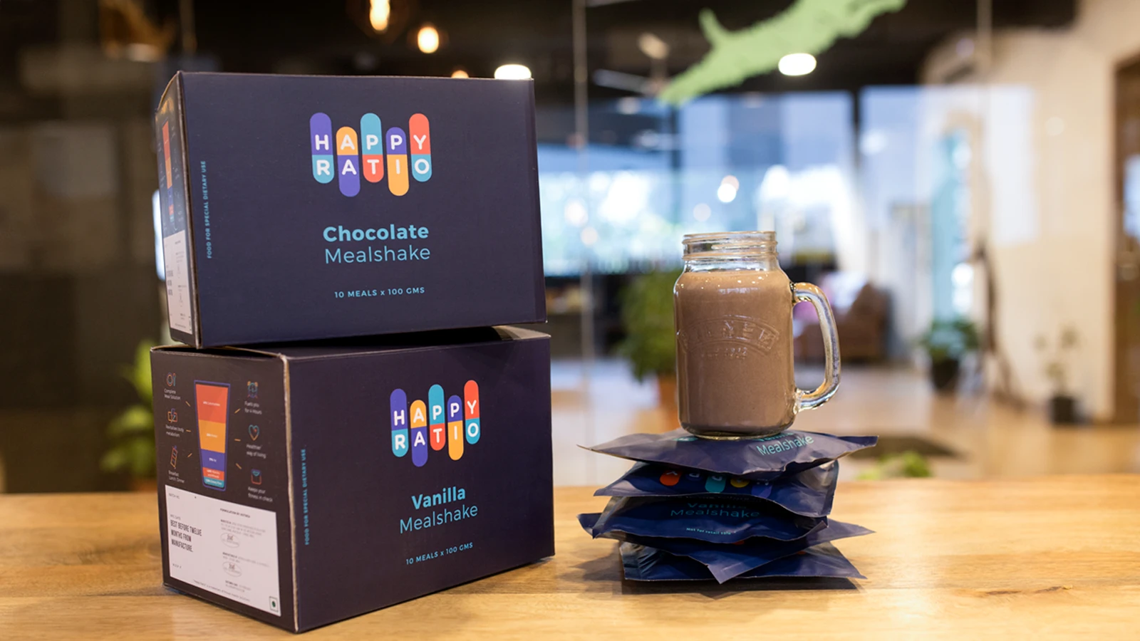
Happy Ratio mealshake packaging alongside a prepared drink.

Work done at Beard Design Studio