Website Design

Founded by a group of senior business journalists and editors from Forbes, Mint and Reuters, The Ken is a pioneering reimagination of business journalism. They post one long form, analytical business story a day, painstakingly researched and written by a team of independent journalists with a strict code of ethics.
The challenge was to reimagine the reading experience on screen.
Started from conceptualising the flows to creating the visual design and communicating the interaction to developers.

The process started with requirement gathering from the client. We understood their Competitors - The Information, Mint, Yourstory, Factor Daily, Economic Times References - The Information, New Yorker, Backchannel etc. Expected sources of visitors - email/newsletter, social media and google search Marketing plan - Social, frequent contests Required article formats - long, short, text + image, illustration only, data/charts etc. Components required for the same - pull quotes, comments, drop-caps etc.
I started with a thorough competitive and functionality analysis and gathered aesthetic references from various digital and print media
Research helped me immerse into user’s experience, uncover their needs and I could chalk out the characteristics and inferences
Characteristics
Inferences
This Editorial research quickly revealed two things - the reading experience on screen was boring and templatized - and the reading experience is print was far richer with beautiful visualisations, fresh layouts and layers of content around the main narrative. This set up the goal of work on The Ken - to bring the richness of print magazines to the web.
Ideate
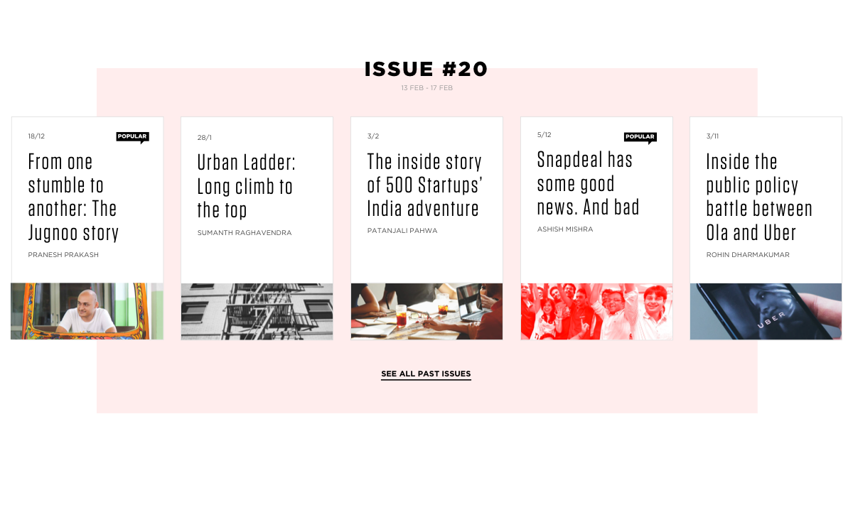
We consolidated the feature list, divided the task in hand into several modules so we could solve for each pain point, design components separately, do quick iterations, come back and refine the design.
Discovery
Conversion Optimisation
Publishing
Distribution
Iterate
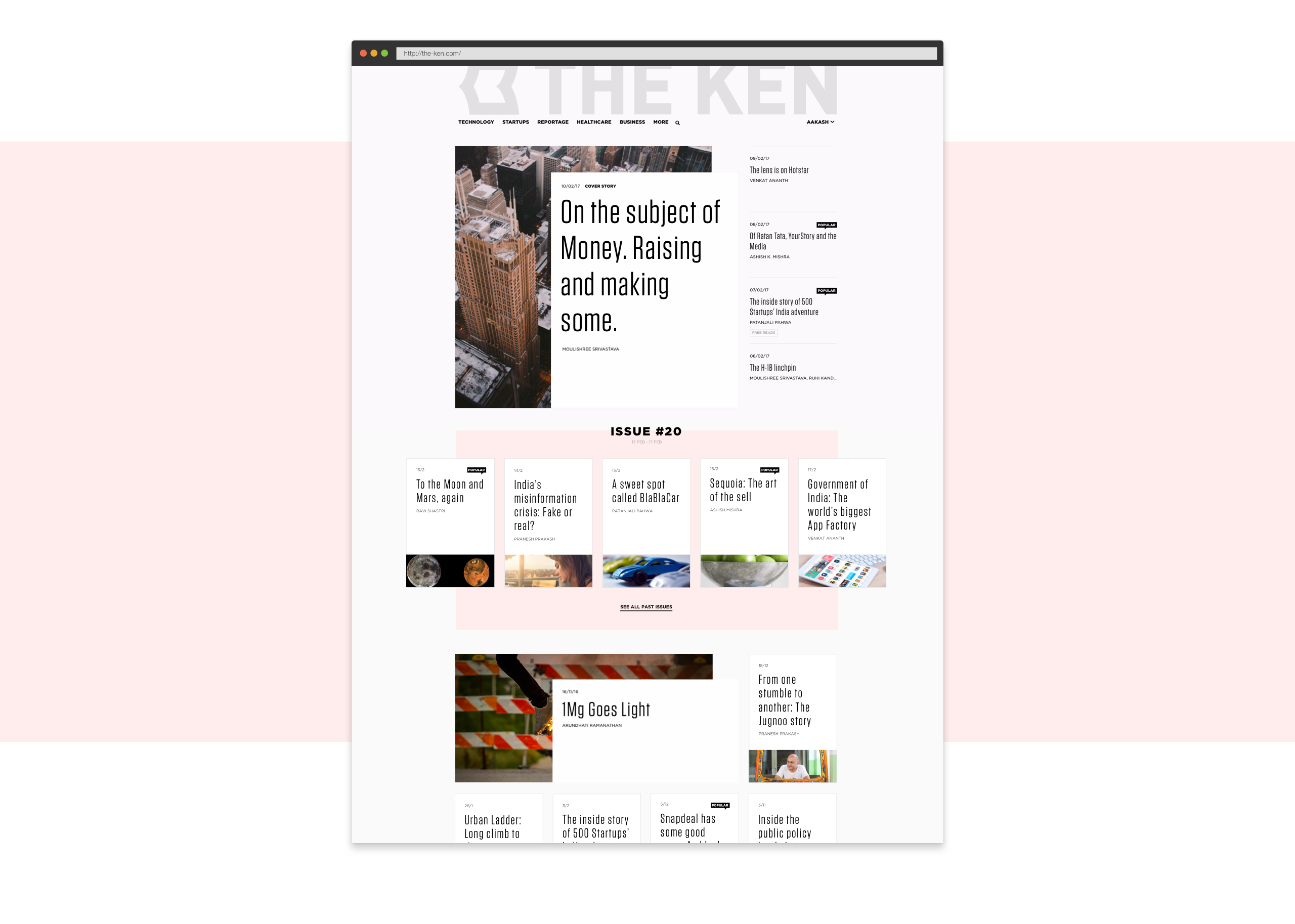
We started with the core - Home Page to establish the visual language, which could be then extended to the other pages
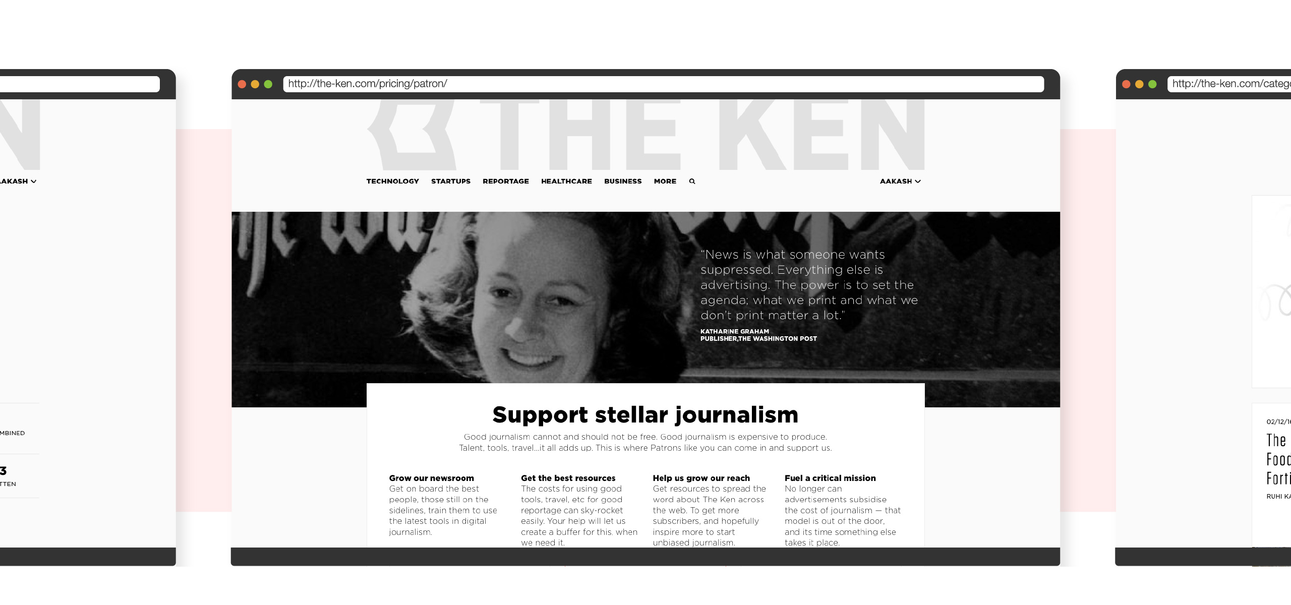
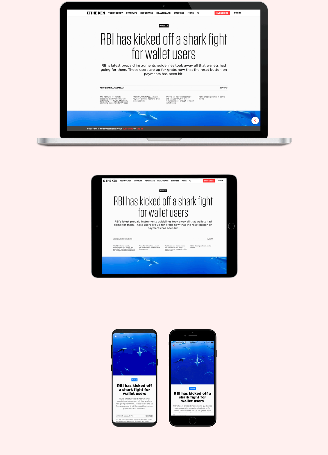
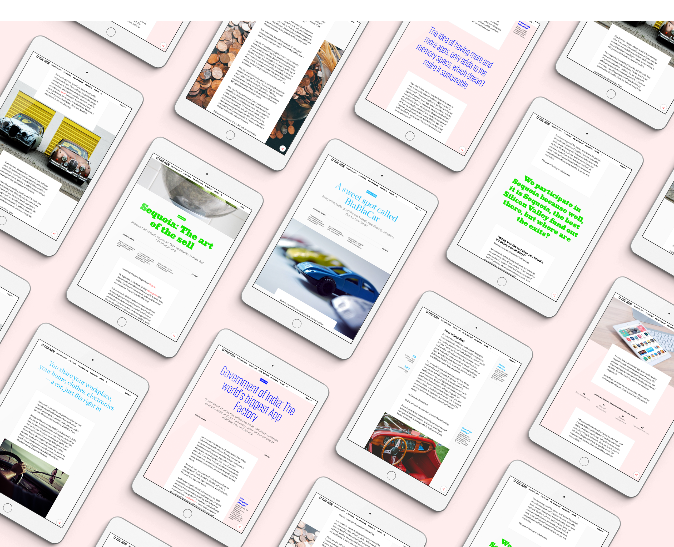
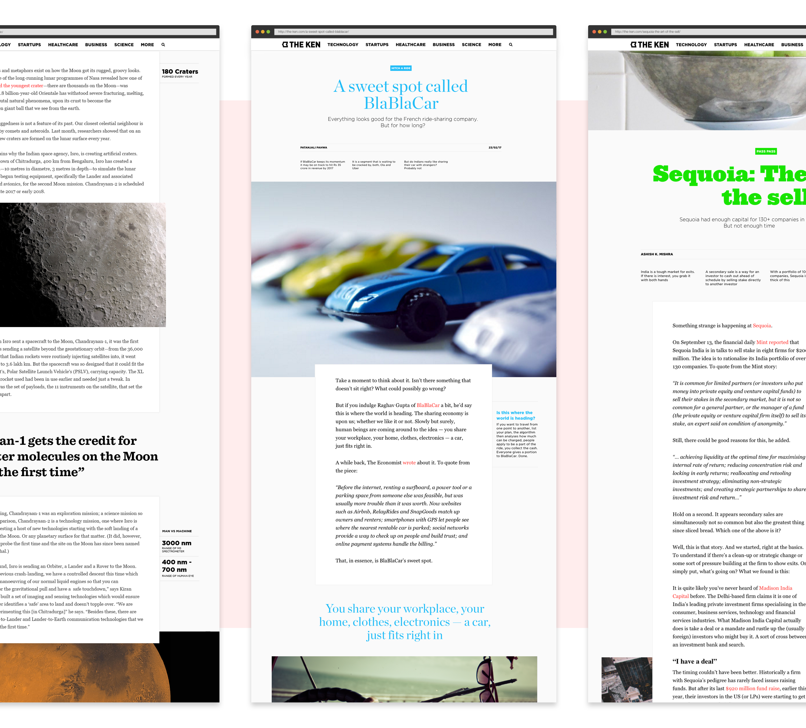
Nailing it down we moved on to the most important page - Article Page. There are constraints of an automated, publishing platform where articles cannot be hand crafted. In order to make each article feel like it was handcrafted just like the beautiful spreads of a print magazine, we built a flexible template that allowed the publisher to control the creative direction of each article - including typography, colours, layouts and other aesthetic elements. When used to its full potential, this makes each article unique
The redesign also gathered a ton of rave reviews – with most users rating their reading experience as dramatically better.
Future
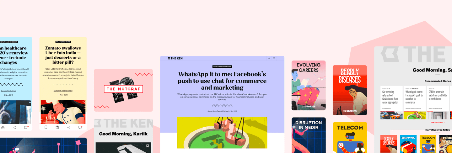
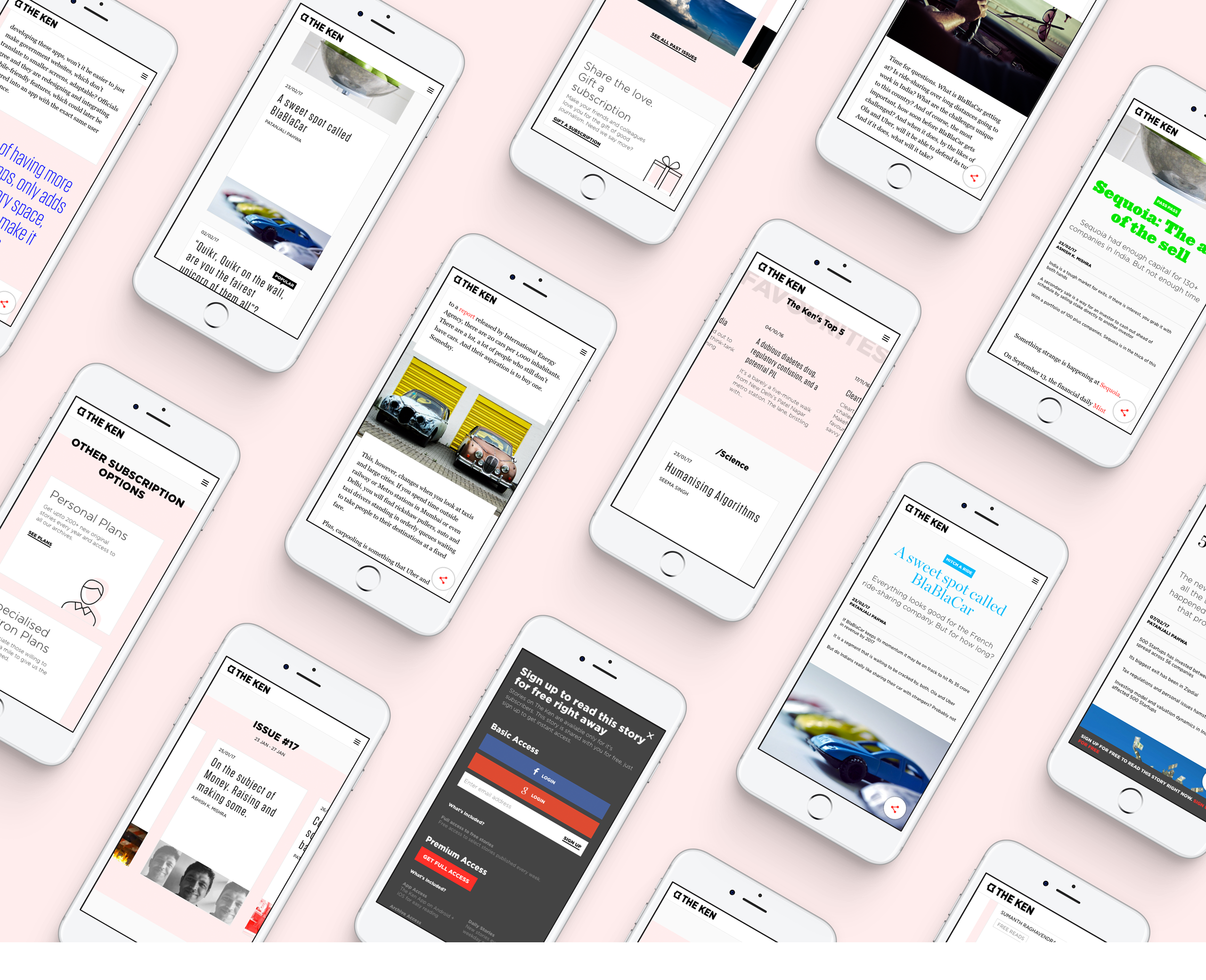
The Ken Apps (iOS and Android) meant for their paid subscribers were build under the premise of doing of extending the reading experience to other areas such as discovery and conversations around the content.
The Ken Apps (iOS and Android) meant for their paid subscribers were build under the premise of doing of extending the reading experience to other areas such as discovery and conversations around the content. While the reading experience remained the same, as the much-loved website, a set of peripheral experiences were designed around that – an intelligent, dynamic reading list, a commenting system that really drives conversations rather than one-off rants, a way for the user to save snippets from articles and go back to the original articles based on snippets and so on.
