
UI/UX

Flock is an online collaboration and messaging platform that solves workplace communication needs. Flock has a powerful suite of business collaboration tools which enhance user productivity.
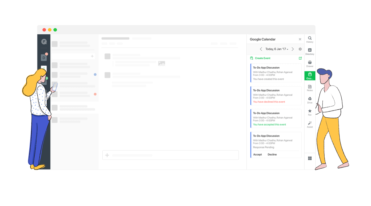
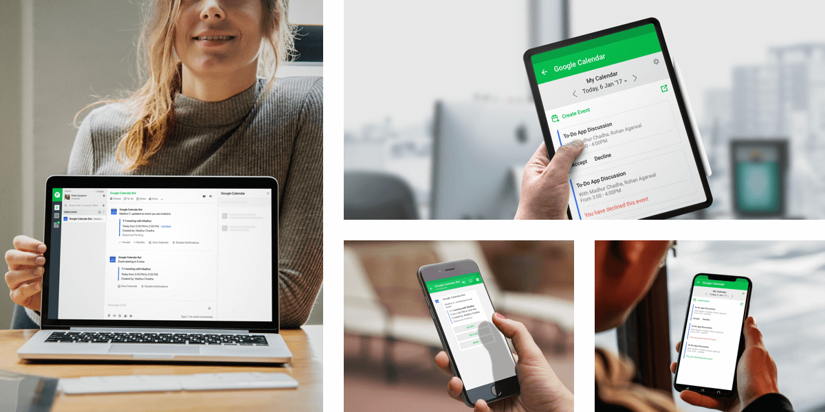
Google Calendar deep integration with Flock allows users to select multiple calendars, assign dates to events, get reminders and updates through the calendar bot within the Flock interface.
Started from research, conceptualising the flows to creating the visual design and communicating the interaction to developers.
People tend to have multiple related topics in a single channel. It’s really difficult to keep up with the timeline-based linear nature of a large or very active group chat. Most of the times you have to interrupt the current conversation flow in order to reply to a previous message, pivoting the conversation back to a previous context.
The most common reasons for this, amongst others, are fast message flows and delayed responses. Users can’t be checking in on group chats all day long. Overlapping conversations in a single channel results into disorganisation of the information and losing the context of the discussion.
Users are profiled based on their department and roles. We conducted customer and market research to drive our planning phase. The key insights defined the launch version of the product
After understanding their actions, feelings, pain points and desired outcomes we went ahead to write the user stories
1. When a technical recruiter wants to set up an interview, she wants to have the list of her events handy to set up interviews, she needs to be in the know if interview needs to be rescheduled and find slot for the same.
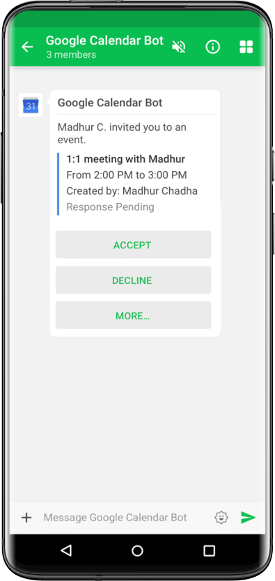
2. When a technical manager gets calendar invite for a meeting, he wants to accept it right away so that he gets notified, he also wants an overview of his upcoming meetings
1. Users plan their day by looking at the meetings lined up for the day. Most use an instant messaging tool at workplace and hence end up responding late for the calendar invites received via gmail.
2. Users often plan their meetings while in a discussion and finalise the time then and there, the extra step to go out of context and create the event for the set of participants in the meeting often gets missed.
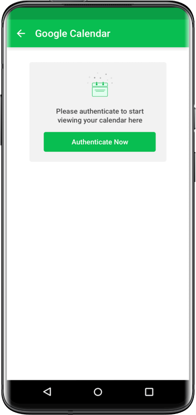
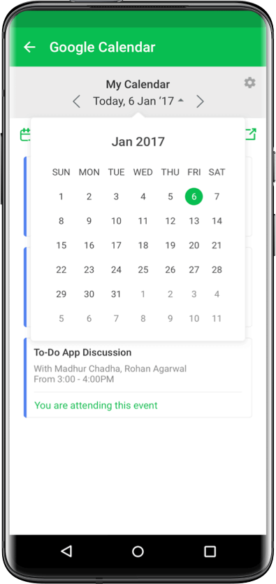
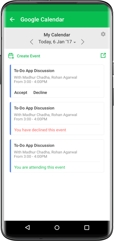
Users are familiar with Google Calendar, if we changed too much the learning curve would steepen and adoption would drop.
Design a quick and intuitive way to access google calendar meetings on Flock, enable users to accept/decline events, send timely reminders before meetings and allow event creation from within Flock.
1. The easiest way for the users to view their daily schedule
2. Easily setting up meetings without losing any context
3. Ensure users are on time for their meetings
Having defined the area we had to focus on, we moved on to ideation. Starting with competitive and functionality analysis.
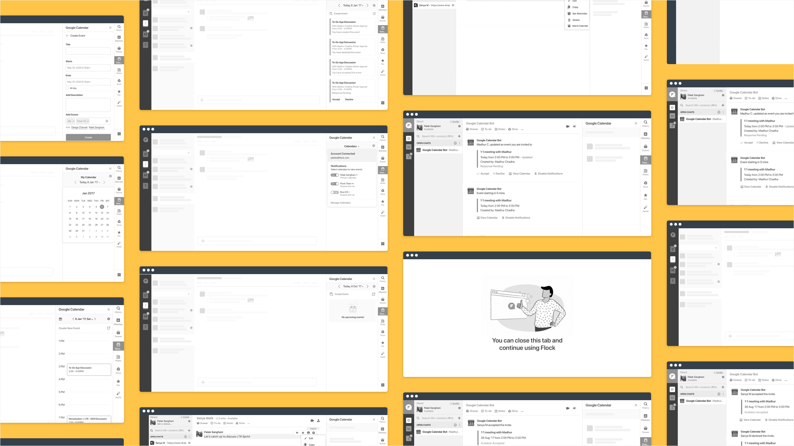
High fidelity wireframes were made to resolve the existing problems.
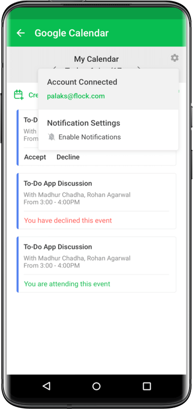
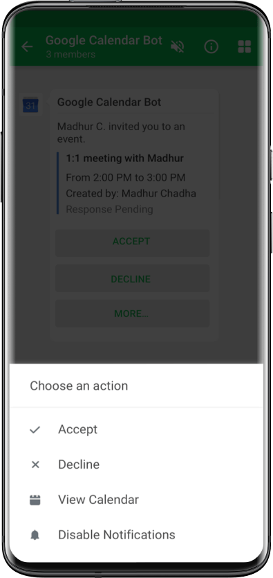
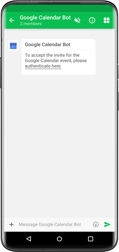
1. Notifications for event invites, updates, reminders and deletion. Users could accept/decline events from within Flock, use of colours to indicate the response. Creator notified when participants accept or decline the event.
2. The users could view all the events of the day through sidebar and accept/decline the events directly from the sidebar.
3. Users could view their upcoming events day wise with details about time, attendees, location, description etc.
4. Users could create/reschedule events from within Flock. The list of invitees for any event from Flock directly based on the selected conversation.
5. Notification alerts sent based on user’s preferences on what he wants to be alerted for.
6. Improved discovery but providing social proofing, showing stats about current usage. For eg. Palak + 75 others are using this app
7. To enhance the experience and usage, natural language parsing was added. Whenever there is a chat revolving around “meeting”, user prompted to create a calendar event using the chat tab
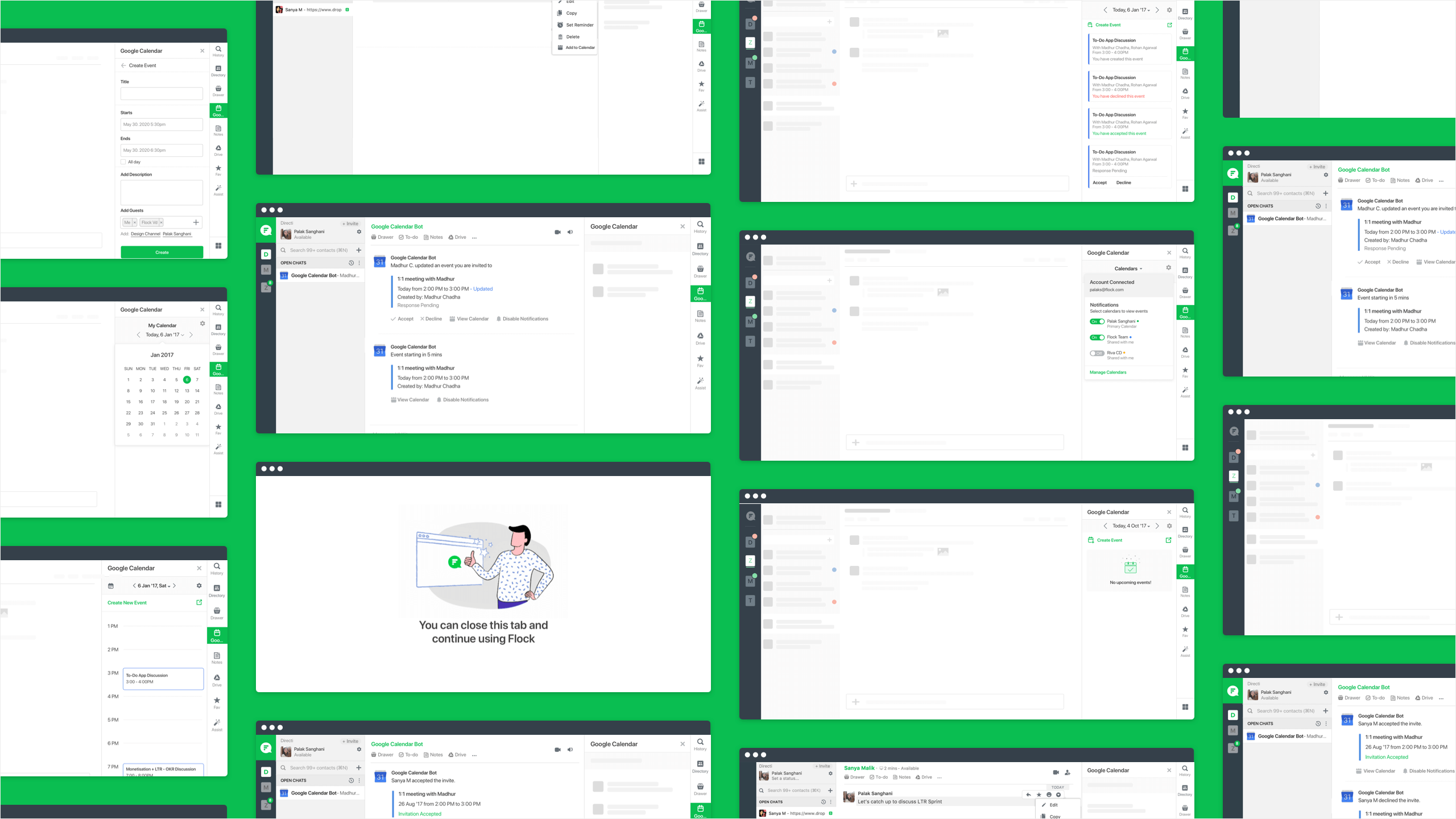
To validate the use cases and the improvements, we conducted multiple rounds of usability tests to understand the problem areas of our solution and get user feedback.
1. Users found it difficult to understand declined events. This was a visual design issue that required multiple iterations to fix.
2. Users wanted to link multiple calendars, in the current solution we supported only the primary calendar.
Deriving from the usability test, peer reviews we made the UI design
1. Google Calendar Integration became one of the top 2 apps in the Business/Productivity Category for Flock.
2. The usage of Google Calendar Integration increased by 300%. It was opened 2 times a day on an average.
3. Over 35% of the events created on Google Calendar linked via Flock were accepted/declined from within Flock
In order to solve the problem better both from the user’s standpoint as well as the stakeholder’s, it’s extremely important to define success beforehand.
We had design choices, Google calendar being a third party application. We found it difficult to introduce features that were not part of the Google Calendar app.