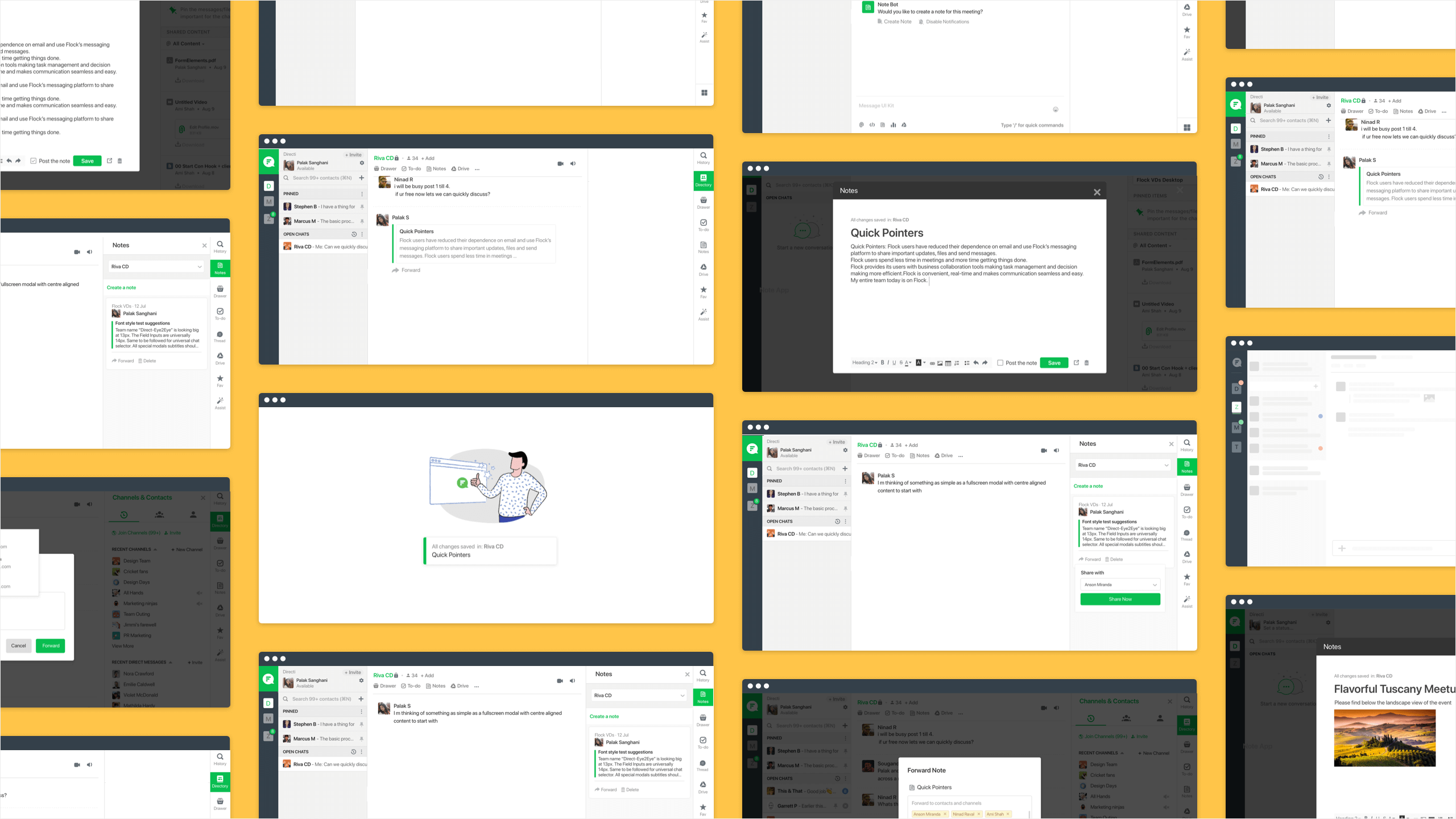
UI/UX

Flock is an online collaboration and messaging platform that solves workplace communication needs. Flock has a powerful suite of business collaboration tools which enhance user productivity.
Got a fantastic idea in the middle of a meeting? With the Notes feature, you can quickly jot down your ideas and share with your teammates. Anyone you've shared the note with can make edits, and all the changes will be updated across the chats you've shared the note in.
Started from research, conceptualising the flows to creating the visual design and communicating the interaction to developers.
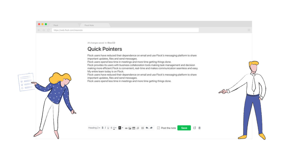
Notes in Flock can be used as a scratch pad to jot down quick notes, save important drafts and share ideas with the team. Notes allow users to organize work, collect everything that matters in one place and find it quickly when they need it.
We conducted customer and market research to drive our planning phase. The key insights defined the launch version of the product
After understanding their actions, feelings, pain points and desired outcomes we went ahead to write the user stories
1. When user is creating a new note, he would like the ability to save it as a draft so that he can work on it multiple times before sharing it.
2. When user is creating a note, he would like it to be on a separate non-blocking window, so that he can continue discussions on Flock, reply to urgent messages.
3. When user creates a note, he would like it to be saved automatically, so that he doesn’t have to press save button every time he is iterating on a particular Note.
4. When a QA wants to upload bug images to a note and mention all the bugs, so that consumers have more context on them,
5. When a PM wants to create a table inside notes so that they can present project plan timelines in a tabular format and organise information better,
1. 83% of teams and 89% of users created between 1-5 notes.
2. 52% users opened notes using the app launcher button.
3. Notes created per user as well as per teams was declining over time.
4. On a month on month basis absolute number of notes created had been growing, though the rate was not consistent.
1. Active teams with sizeable team size used notes heavily and derived maximum value from the feature.
2. Adding more hooks and features would cover more use cases and lead to more notes creation.
3. Team retention on Flock would improve with increase in usage of notes.
1. Overhauling the Note creation experience might be unsettling for existing Notes users
2. Adding new Note creation hooks and nudges might feel spammy to some users.
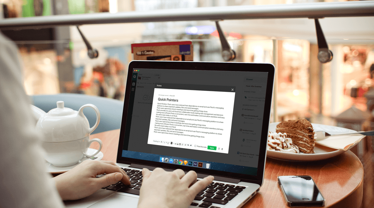
1. Improve overall experience of using Notes App
2. Increase usage of Notes App amongst active users and teams
Having defined the area we had to focus on, we moved on to ideation. Starting with competitive and functionality analysis.
We checked other apps and platforms with similar functionality for insights into common patterns to understand user’s mental model - Slack, Evernote, Google Keep, Zoho Notebook, Apple Notes, Dropbox Paper etc. and prepared moodboards to explore creative ways to solve the existing problems.
1. We should design for the first time experience also, take users through the process of create their first note and nudge them towards discovery of other features.
2. Dashboard should be a list of notes arranged with the recent first, maybe with tags to allow users to organize the notes in different categories. Allow users to pin important notes. List and grid views of all notes.
3. Allow Create/View/Edit in a new tab - clean interface without any distractions.
4. Editing Functionality should include - Font, Font Size, Font Colour, Bold/Italic/Underline/Strikethrough, Superscript/Subscript, Bullet List/Numbered List/Checklists, Left/Right/Centre Alignment, Indentation, Attachment, Separator Line/Section Break, Link, Undo/Redo, Bracket/Code, Table, Scribble
5. Notes Features like Collaborators,Word Count, Doc History, Print, Download, Delete, Archive, Lock, Background Colours, Comments, Add Media: drawing/recording
6. Auto saving mode should be on, First user creates a post and thereafter shares. (connect with flock)
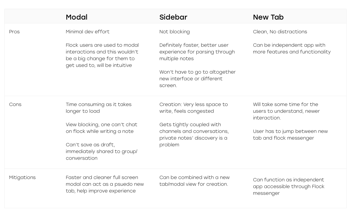
Keeping in mind the tech constraints, user pain points and the established mental models we proposed four different approached. Weighing the pros and cons of all the different models, the sidebar model was selected
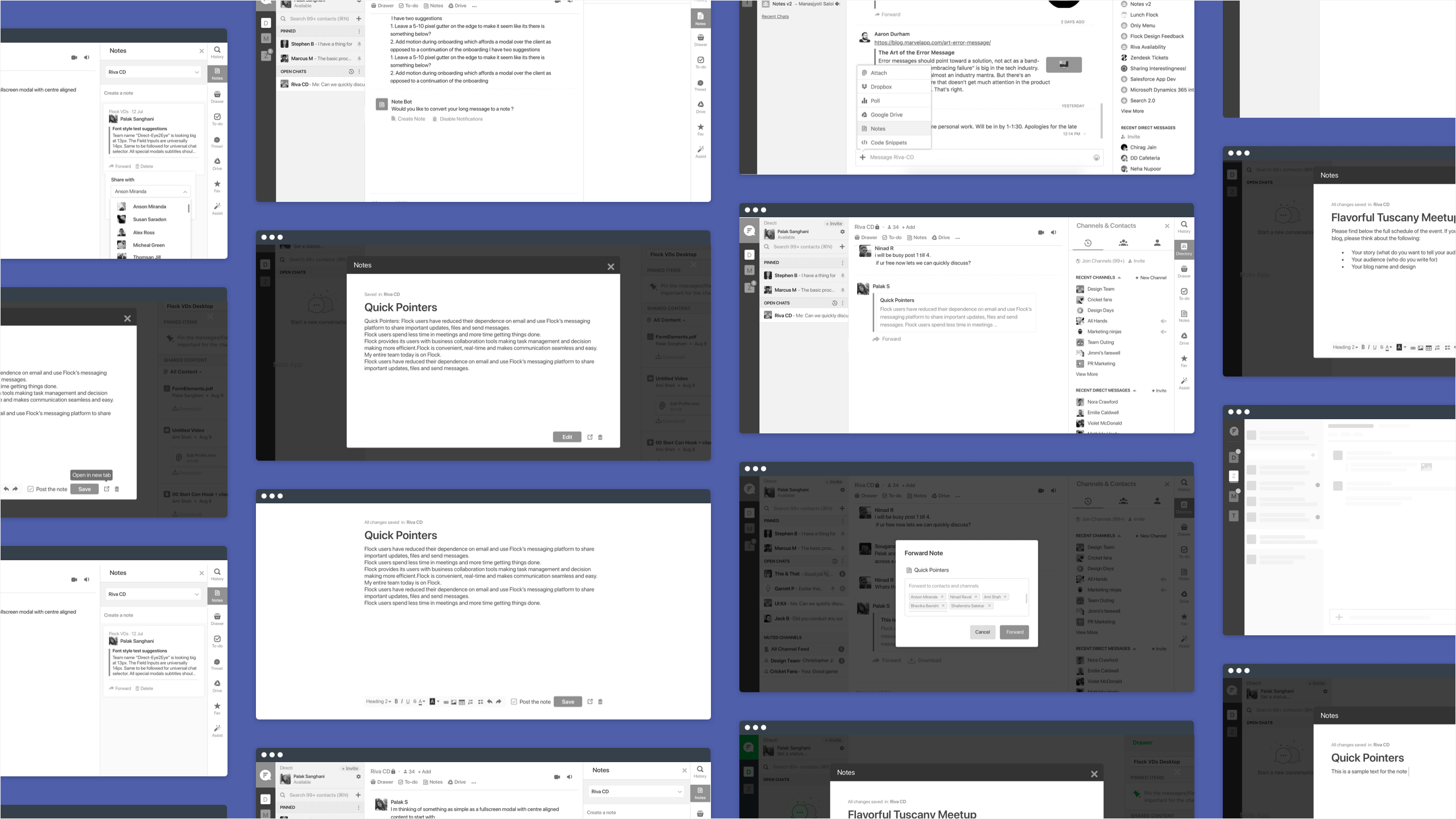
High fidelity wireframes were made to resolve the existing problems.
1. Users could save notes without posting to the channel. All notes not shared with any channel appears iin the drafts section.
2. Users could select whether to post the note to the channel or not. Users can access all public notes from the dashnoard.
3. Users could choose to work on the note on a new browser window by clicking on ‘Open in new tab’ button; both on desktop client and web app. Thus, solving the problem of the note blocking the conversation view.
4. Users could add tables, images and have formatting options like strikethrough, undo/redo etc. Multiple users could write and edit in real time. Notes would be auto saved.
5. If a meeting is about to start users are sent notifications to create a MoM.
6. When creating a long message, users prompted about converting it to a note so that people can view it with ease later.
7. When users access notes app on the mobile, allow them to see all previously created notes as quickly as possible.
To validate the use cases and the improvements, we conducted multiple rounds of user testing with a dozen of participants on functional prototypes. We recorded their responses and compared the data. With each round of testing there was one thing that worked perfectly, we took each nugget that worked right and modified the design to what it is currently.
Deriving from the usability test, peer reviews we made the UI design
