UI/UX
Flock is an online collaboration and messaging platform that solves workplace communication needs. Flock has a powerful suite of business collaboration tools which enhance user productivity.
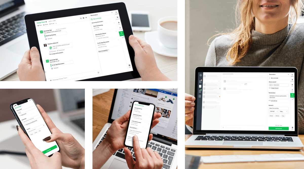
Reminder lets you keep track of everything in one place, so you can get it all done and enjoy more peace of mind along the way. Reminders was targeted for the tech-savvy users to stay organised at work.
Started from conceptualising the flows to creating the visual design and communicating the interaction to developers.
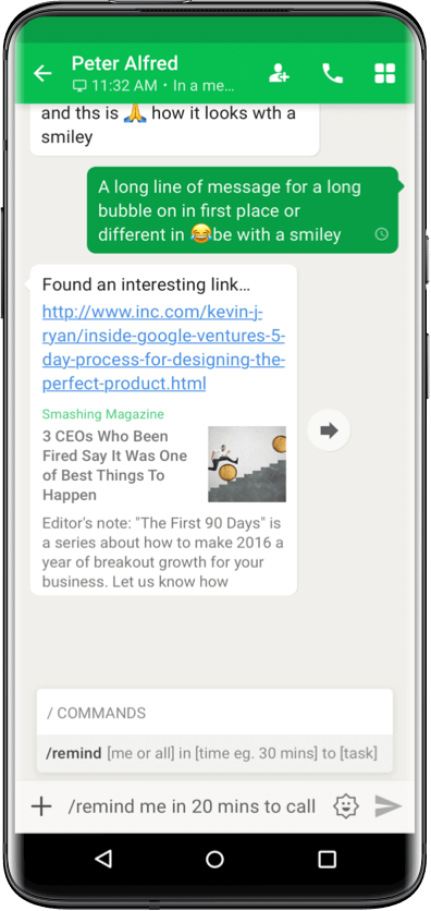
Earlier, reminders in flock were through slash commands,
you could set a reminder anywhere and Reminder bot would notify you. This didn’t seem to solve users
problems
1. Typing into the chat box was unintuitive and obscure.
2. The app didn’t let one set custom reminders, to remind someone or the channel.
We needed a fresh approach to solve the discovery problem of reminders and solving user needs at workplace. To get a better idea of what the users really wanted, we did a simple thing: we talked to the users.

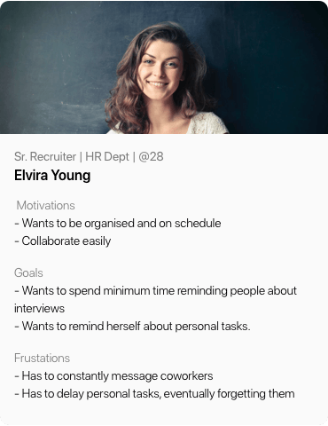
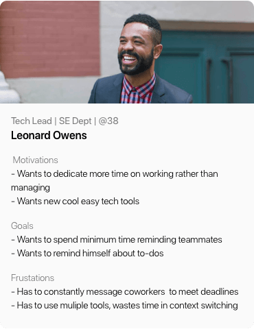
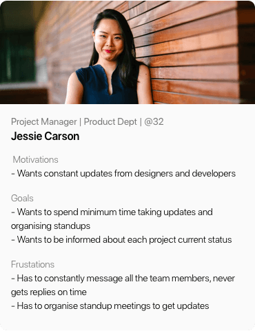
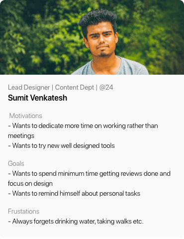
Users are profiled based on their department and roles. We
derived the key personas and interviewed them to understand their behaviour, problems and
motivations.
After understanding their actions, feelings, pain points and desired outcomes we went ahead to write the job stories.
1. HR wanted to be reminded to follow up with a candidate at a particular time.
2. Product Manager wanted to remind everyone of a due deadline.
3. Project Manager wanted to save himself from the hassle of asking weekly reminders every Monday.
4. Designer wanted to be reminded to take walks, drink water etc.
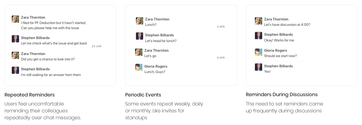
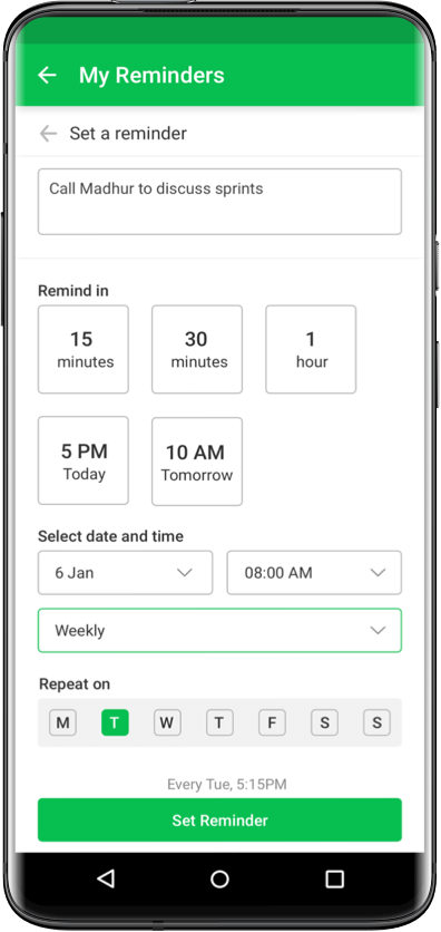
The insights gathered from the user interviews were that users felt uncomfortable in sending out reminders repeatedly over chat messages, there were many events that repeated periodically eg. standups and the thought of setting reminders mostly spur during discussions.
Insights helped us define our goal
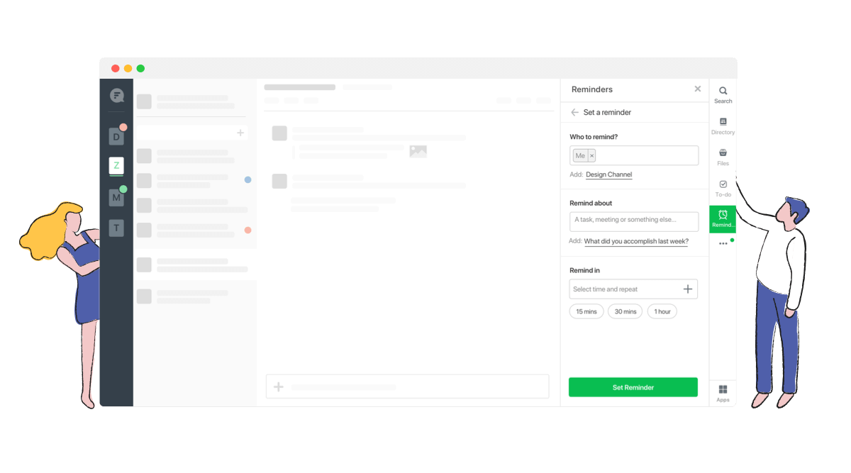
“Design quick & seamless way to set reminders in flock enabling users to set recurring reminders,
reminders for themselves and for others”
Having defined the area we had to focus on, we moved on to ideation. Starting with competitive and functionality analysis.
We checked other apps and platforms with similar functionality for insights into common patterns - Google Calendar, Google Keep, Evernote, Apple Reminders, Slack etc. and prepared moodboards to explore creative ways to solve the existing problems.
The aim was to solve for each job story.
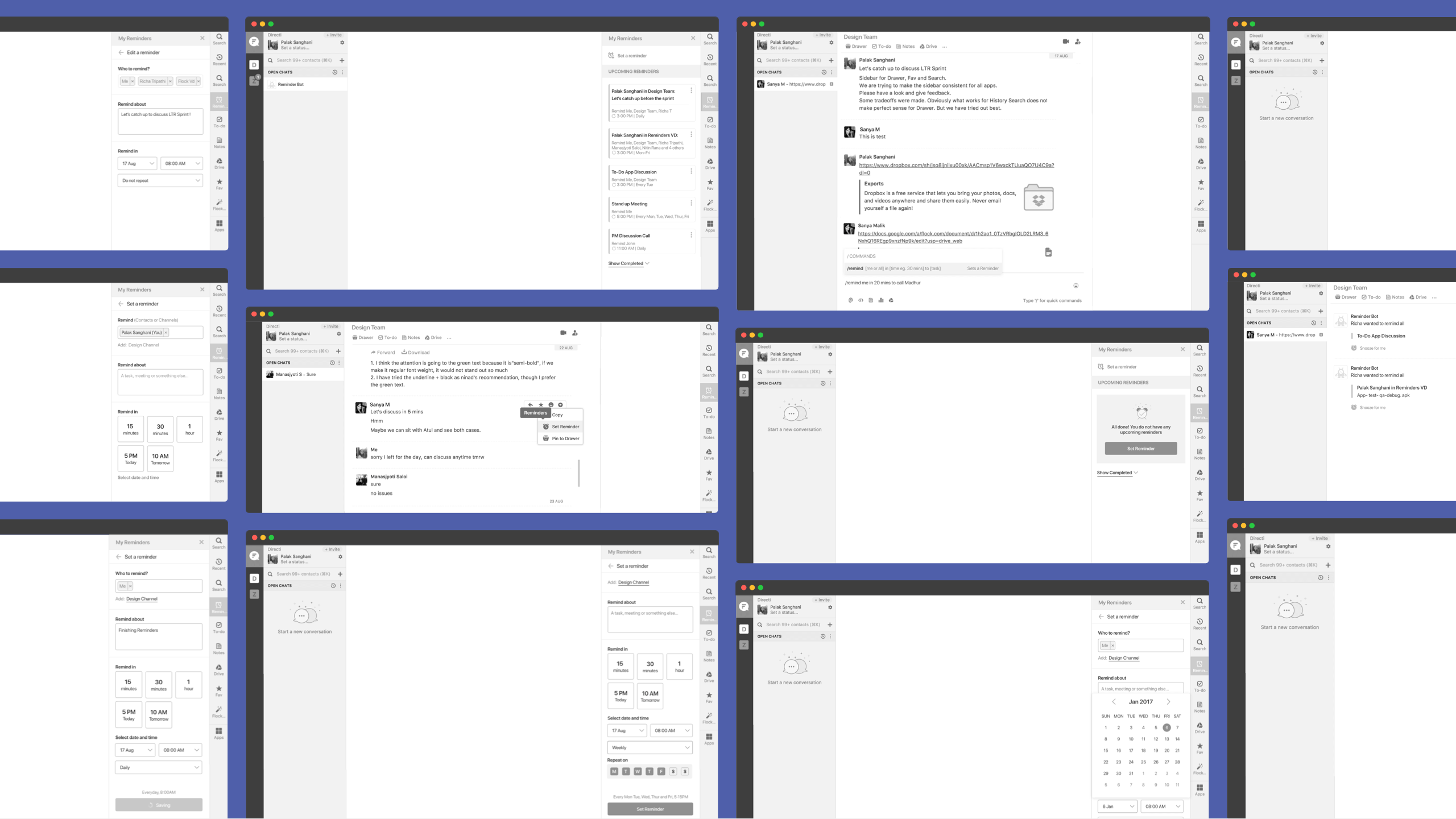
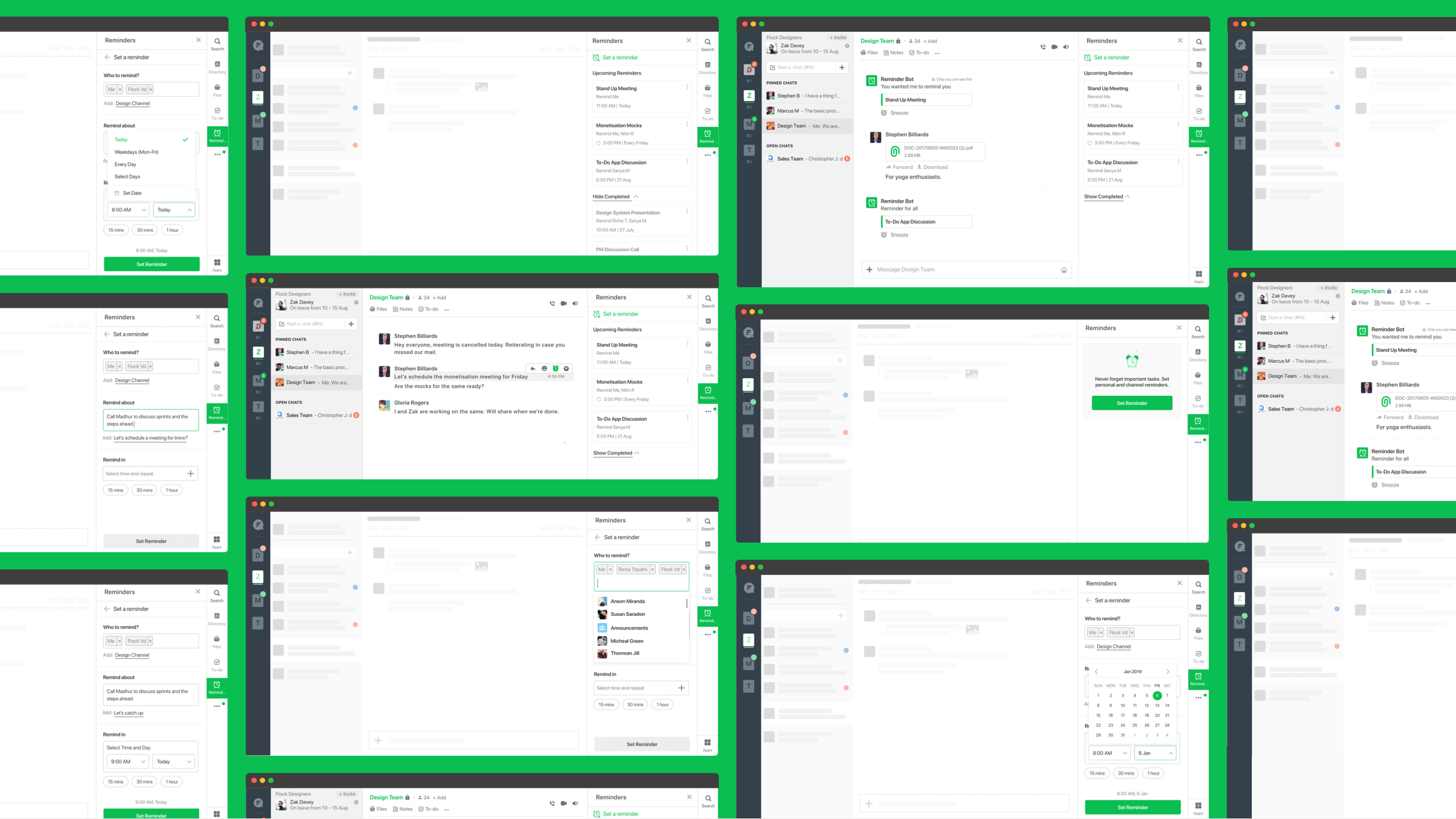
High fidelity wireframes were made to resolve the existing problems.
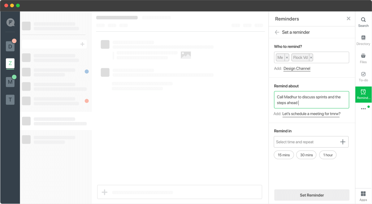
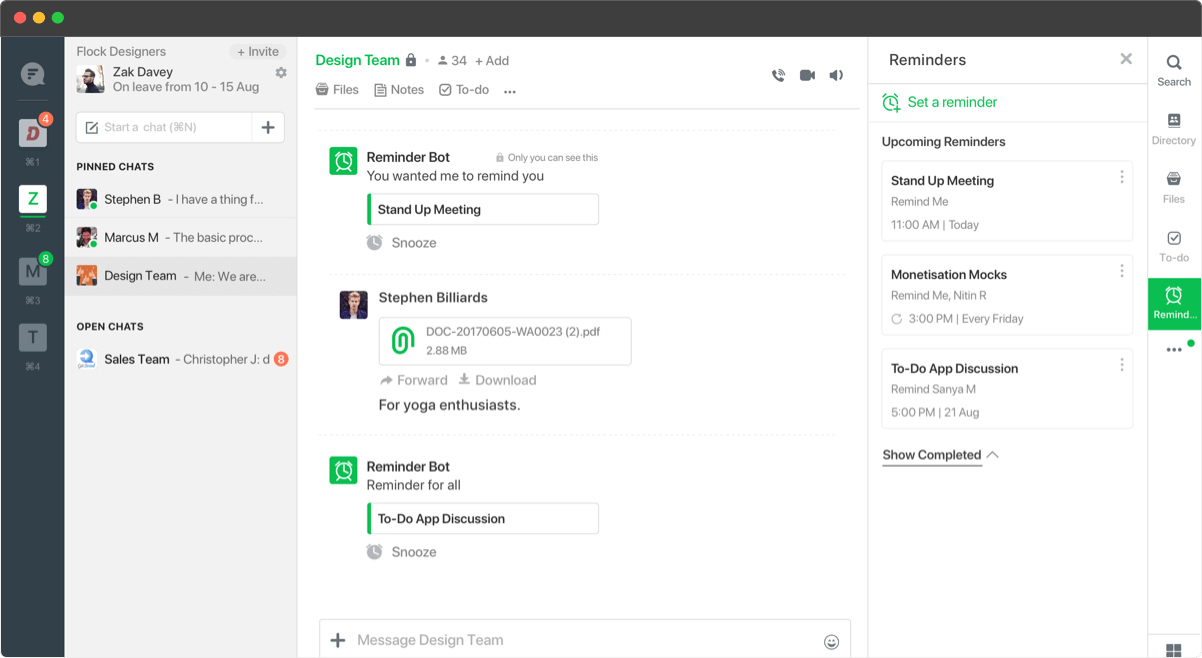
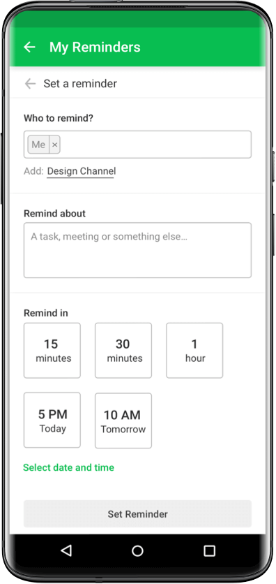
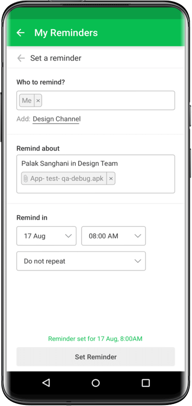
1. Reminders was added as a pre installed app, to ensure high discoverability.
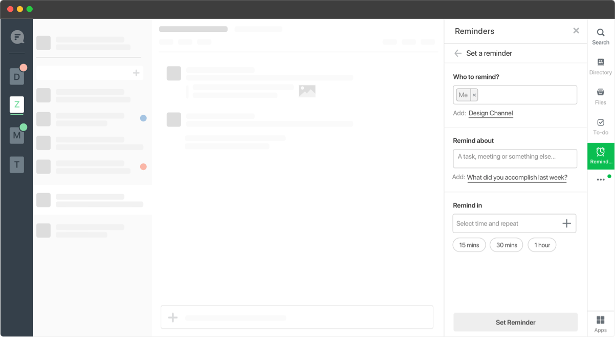
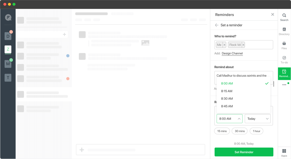
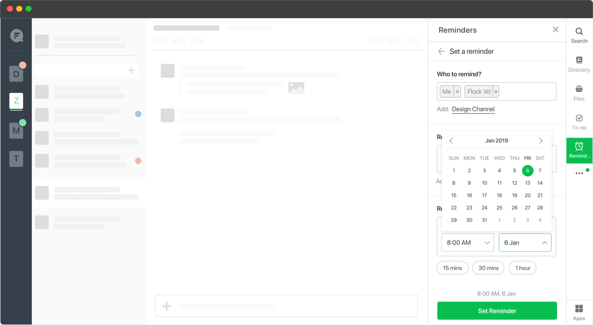
2. We added time shortcuts to make a quick choice and not having to go through the hassle of selecting a custom time.
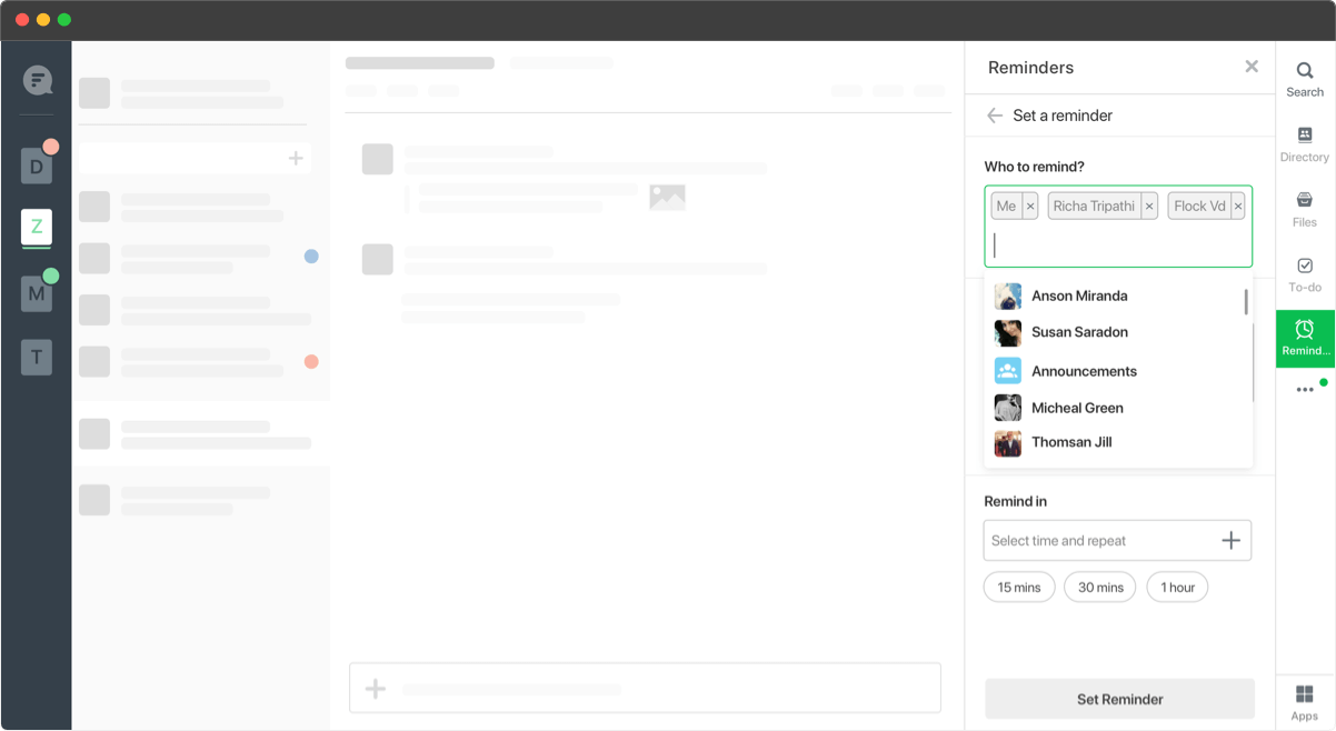
3. The recipient was defaulted to ‘Me’, for setting up quick personal reminders.
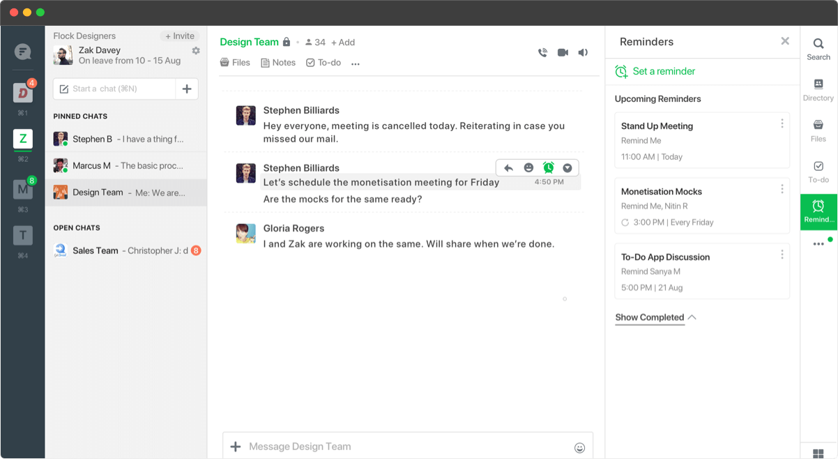
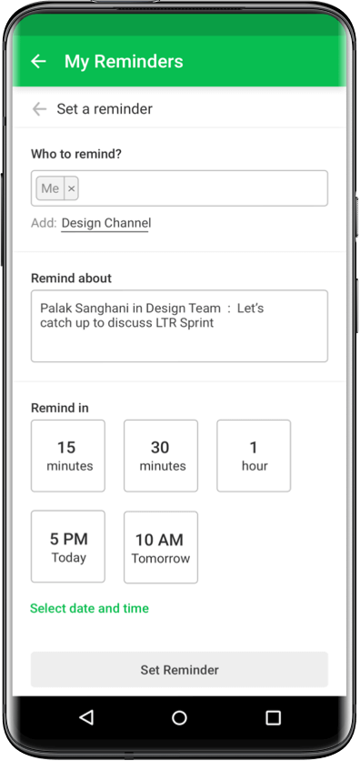
4. All chat messages had hooks to set reminder, this resulted in prefilled titles (contextual discovery use case).
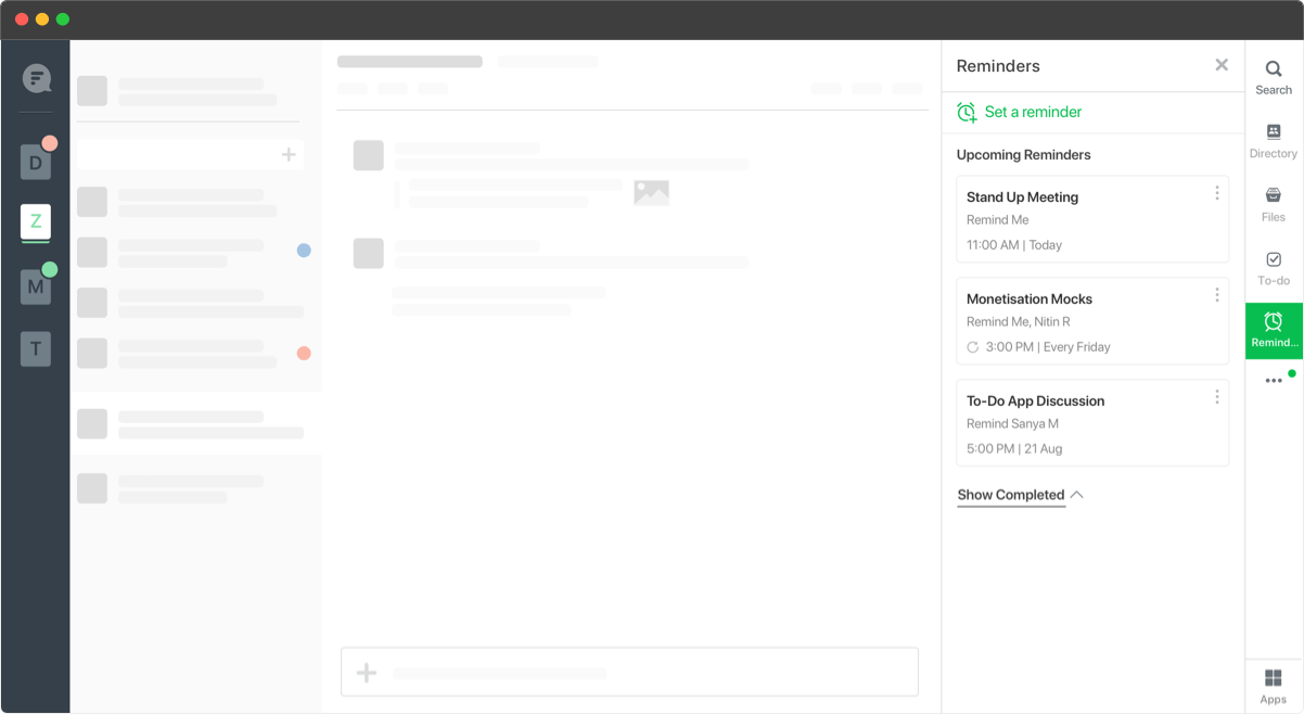
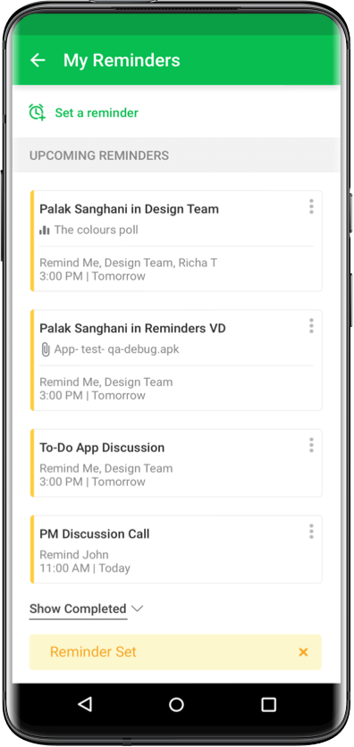
5. A home screen for reminders, a single place for users to track all reminders.
6. Notifications of reminders sent via reminder bot. Users allowed to snooze reminders for themselves
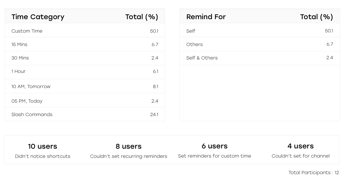
To validate the use cases and the improvements, we conducted a round of user testing with a dozen of participants on a fully functional prototype. We recorded their responses and compared the data.
Deriving from the usability test, peer reviews we made the UI design
1. Increased precedence of the ‘Custom Time’.
2. Reduced time shortcut options.
3. Increased affordance and visibility of recipient suggestions.
4. Tried a conversational tone for the copy.
Reminders’ usage increased by 3.5 times after the revamp
Testing on a fully functional prototype revealed surprising findings. We expected the users to use the time shortcuts extensively but results revealed exactly opposite.
Integrate the functionality seamlessly with chats, increasing the possibilities & needs to solve for design and tech constraints. Had to stay within the sidebar for all design explorations.
1. Trying to reduce the options, so as to not overwhelm the users
2. Trying to add a few quick nudges for reminders like- drink water
3. Trying to merge check-ins (Stand-up reminders) with recurring reminder