
UI/UX

Flock is an online collaboration and messaging platform that solves workplace communication needs. Flock has a powerful suite of business collaboration tools which enhance user productivity.
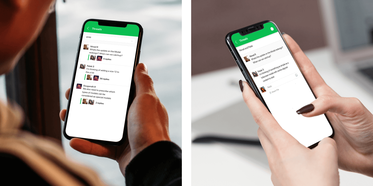
Go ahead, ask questions and dig deeper, have side conversations, or go on a tangent without interrupting the flow of conversation! Discussions can evolve, branch off, new topics are introduced or old ones resurface. Threads helps connect related messages, make it easier to follow and manage variety of conversations
Started from research, conceptualising the flows to creating the visual design and communicating the interaction to developers.
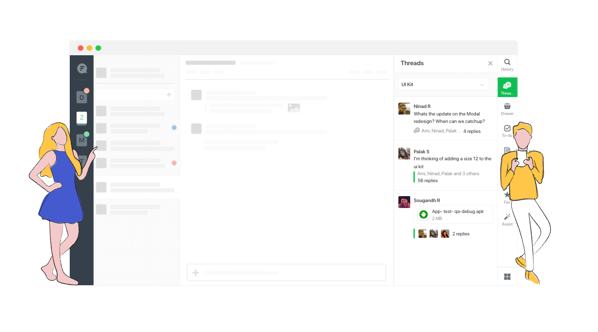
People tend to have multiple related topics in a single channel. It’s really difficult to keep up with the timeline-based linear nature of a large or very active group chat. Most of the times you have to interrupt the current conversation flow in order to reply to a previous message, pivoting the conversation back to a previous context.
The most common reasons for this, amongst others, are fast message flows and delayed responses. Users can’t be checking in on group chats all day long. Overlapping conversations in a single channel results into disorganisation of the information and losing the context of the discussion.
sers are profiled based on their department and roles. We
conducted customer and market research to drive our planning phase. The key insights defined the
launch version of the product
After understanding their actions, feelings, pain points and desired outcomes we went ahead to write the user stories
1. When a designer wants to discuss about Design updates in a channel while the project manager is taking updates on other tasks, user want to start a new thread so that conversations don't get mixed up
2. When a manager is away for a while and lot of discussion has happened in a channel, user wants to see the entire discussions pertaining to a specific topic together to avoid parsing through hundreds of unrelated messages
In order to provide an effective solution we first tried to understand how users currently address this problem and how do they generally interact with channel messages. If the user wants to reply to something that’s missed on a group chat, he has only the following ways

The task is done, not a problem if it’s not a serious thread. The recipient isn’t notified about the particular reply. The chat conversation context is broken.
Instant and faster then text message. The recipient isn’t notified. Reactions do not help further engagement due to their curt nature.
Fast, can mention multiple people. Engaging as the recipient gets notified. Message still interrupts the conversation flow.
Engaging, recipient is notified. group conversation is broken, as it moves to personal environment and the group members will miss it.
Emails have threaded conversations, one of the binding feature to users which is preventing them to let go of emails even while using enterprise based chat messaging platforms. While trying to bring the benefits of threaded conversations to chat platform the risk was to disrupt the casual chat room vibe.
Discuss divergent yet essential thought processes in a single channel without distracting the
channel’s audience. Overlapping conversations in a channel, yet organised information
Grouping these messages to allow users to easily get back to discussions around a thread at a later
time, preserving meaningful context.
Decluttering the main conversation but improving the consumption of threads within the channel
Having defined the area we had to focus on, we moved on to ideation. Starting with competitive and functionality analysis.
We checked other apps and platforms with similar functionality for insights into common patterns to understand user’s mental model - Slack, Flockdock, Google Chat, Microsoft Teams, Facebook Workplace etc. and prepared moodboards to explore creative ways to solve the existing problems.
| Criteria | Slack | Teams | GChat | Flowdock |
|---|---|---|---|---|
| Model | Sidebar |
Inline |
Inline |
Inline Hashatags |
| Where? | Groups + DMs |
Groups Only |
Groups + DMs |
Groups Only |
| New Message Positioning | Thread remains at the same position, New messages highlighted in the global view |
Moves the entire thread to the end of conversation |
Move the entire thread to the end of conversation. Different views for all members. |
Last message displayed in the main conversation, at the end of the scroll. |
| Notification Triggers | New Thread
notification |
New message |
New message |
New message |
| Dedicated Hook | Yes. The last interacted threads are shown at the top. |
No |
No |
No |
Keeping in mind the tech constraints, user pain points and the established mental models we proposed four different approached. Weighing the pros and cons of all the different models, the sidebar model was selected
| Sidebar | Inline | Hashtags | Modal | |
|---|---|---|---|---|
| Pros | -A dedicated hook that doesn’t block main chat. |
- Threads weaved in with conversations, context retained |
-Encourages topic based conversations |
-Less dev effort, |
| Cons | -Context lost when some members reply to thread and some send new messages. |
-Visibility lost when new messages added to exisiting thread. |
- Added effort to add hashtags, remember them |
- Blocks the main chat view, entirely new screen to view threads. |
| Mitigations | - Less probability of missing new thread messages |
-High probability of messages being lost due, if notification is missed. |
- Can automate them for quick replies and exhaust them after a certain time interval. |
-Not user friendly, if slow and members forced to scroll. |
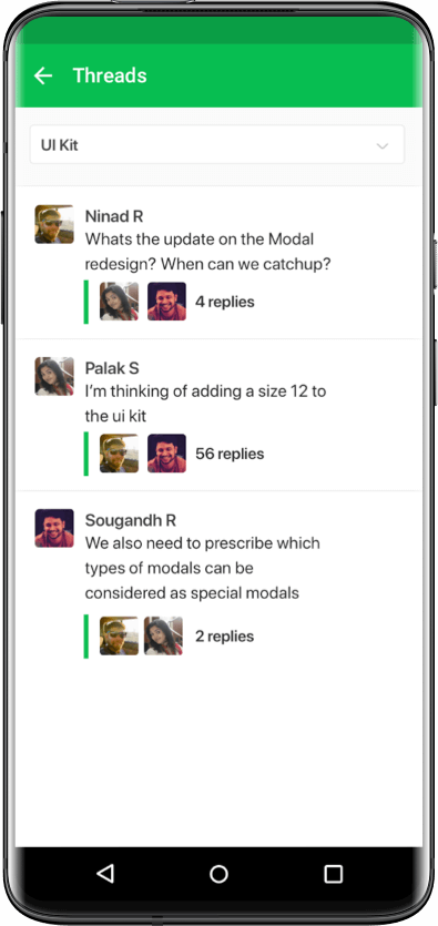
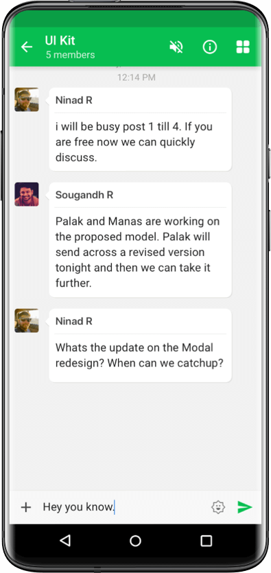
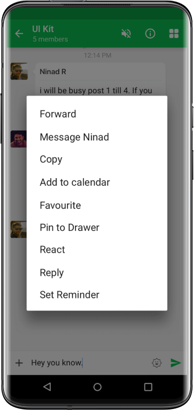
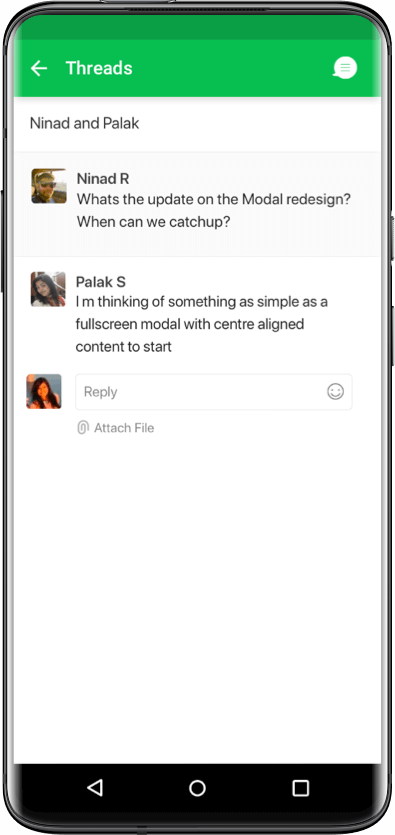
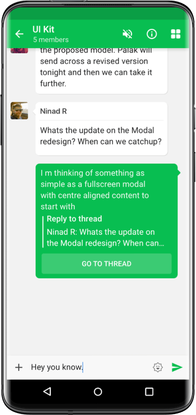
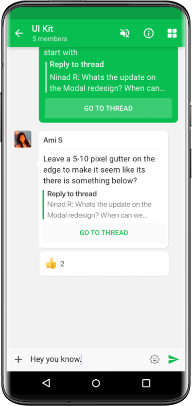
High fidelity wireframes were made to resolve the existing problems. Building on the analogy of an open room conversation, when three people are talking forming an group in a room full of people, there may be lot of people around who may or may not pay heed to the conversation between the three people. Threads functioned in the same way, they provide a dedicate sidetrack to the main conversation chat which people can consciously take a call whether they want to participate.
1. Threads app added as a pre installed app, to ensure high discoverability.
2. Users were allowed to convert any existing message into a thread.‘Start a thread’ message action button given high prominence over other buttons, to entice users into creating threads.
3. Sidebar opened for creation of a thread, showing the original message on which thread was started. Message input field at the bottom of the screen to reply to the thread. Checkbox to duplicate the reply in the main chat conversation checked by default.
4. The original message attachment updated to reflect the total reply count, this action link could be used to view the entire thread in the sidebar.
5. If the reply was duplicated to the main conversation, it was displayed along with the original message and CTA to open the thread on the sidebar. If the reply was not duplicated to the main conversation then Sender Visible Messages were sent to the participants to notify them of the activity in the thread. It displayed the reply along with original message and CTA buttons to open the thread in the sidebar or disable the notifications for the particular thread.
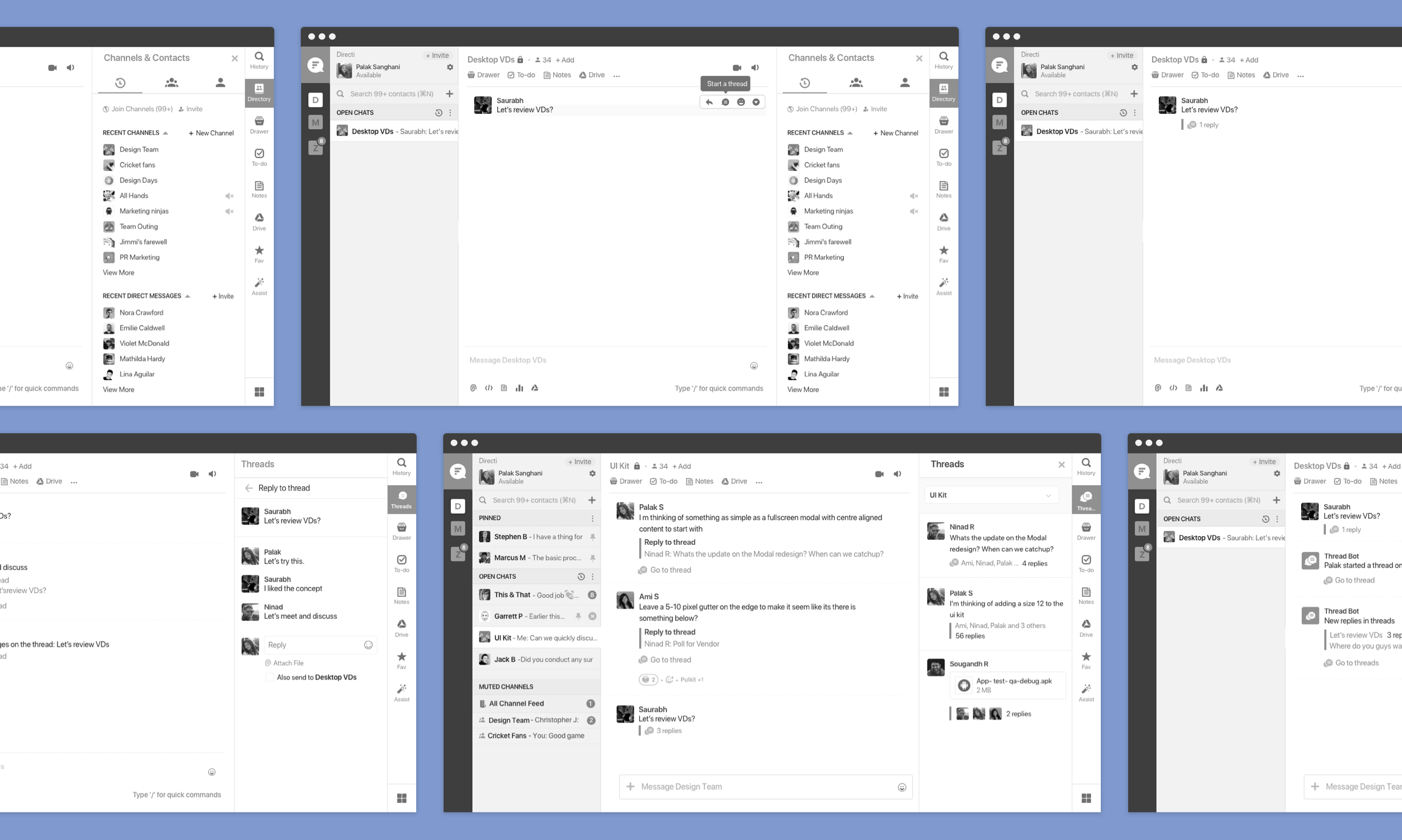
To validate the use cases and the improvements, we conducted multiple rounds of user testing with a dozen of participants on functional prototypes. We recorded their responses and compared the data. With each round of testing there was one thing that worked perfectly, we took each nugget that worked right and modified the design to what it is currently.
Deriving from the usability test, peer reviews we made the UI design
1. Message Input field made floating to ensure it’s not missed and to increase visibility. Input field made to stick to the bottom of the screen only when threads become scrollable. Checkbox to duplicate the reply in the main chat conversation unchecked by default to declutter the main chat
2. Added option to attach files and images. Dragging and dropping attachments was enabled for the desktop client.
3. Added support for mentioning users and looping in new people. Easy to jump into any thread and mentioning new people to get their inputs.
3. New replies on original message represented in rollup to discover other participants. Easy to grasp. Also added a tag in case of new unread messages. This acted as a subtle nudge for the users to visit the threaded conversation.
4. Bot message was sent 24 hours later for summarising all the channel threads. Showing the original message on which thread is started along with the reply count.