UI/UX

Flock is an online collaboration and messaging platform that solves workplace communication needs. Flock has a powerful suite of business collaboration tools which enhance user productivity.
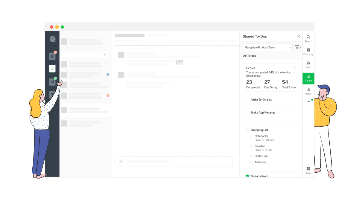
Launching a new product? You can create a channel for the project and quickly turn those discussions into tasks by creating to-dos for you and your team. Add due dates and that's it. Let the Shared To-dos bot remind you every morning of tasks due on that day. No need to chase deadlines at the last moment.
Started from research, conceptualising the flows to creating the visual design and communicating the interaction to developers.

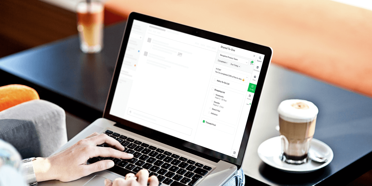
Shared To-Dos app helps you set tasks for yourself and your team so you don’t have to chase deadlines at the last moment.
In less than a minute, you can jot down to-dos in Flock, assign them to team members, and set due dates. Everyone in the channel is notified when To-Dos are completed.
We conducted customer and market research to drive our planning phase. The key insights defined the launch version of the product
1. Users organise tasks day wise so that they can come and check these later.
2. Every day has around 4-5 broad tasks.
3. User keeps checking the document frequently throughout the day.
4. Users generally type the tasks in a channel than using to-dos.
After understanding their actions, feelings, pain points and desired outcomes we went ahead to write the user stories
1. When user handles multiple projects at a time, he wanta to create a to-do list for everyday so that he doesn’t miss on any pending task pending.
2. When user is managing a team of designers, he wants to create a common to-do list for the team so that everyone is up to date with their responsibilities.
3. When a Project Manager wants to create a common place to assign tasks so that he can keep a track of the status of the tasks.
4. When user is working with someone on the same project and wants to divide the tasks, assign it accordingly so that the both of them are aware of who is responsible for which task.
5. When a manager wants to assign tasks to his team members and set a due date so that the project does not get delayed.
1. 82% of the to-dos created are completed, 40% of them are assigned to an individual
2. Users create 3.5 times more to-dos in a month as compared to notes.
3. 59.5% of user create less than 5 to-dos in a month.
1. Introducing nudges and improving the discovery of the To-do App should increase the usage of the To-do App among LTR users
2. Delightful experience of the To-do app should increase the frequency of To-do App used by the existing users of the To-do App
3. Increase in the usage of To-do App will result in improving LTR teams retention
1. Adding more power user functionality like filters, recurring to-dos can confuse existing To-do App users
2. Adding more hooks to discover and nudges for the To-do App might become spammy for the existing users of the To-do App
1. Improve overall experience of using To-dos App
2. Increase usage of To-dos App amongst active users and teams
1 Having defined the area we had to focus on, we moved on to ideation. Starting with competitive and functionality analysis.
1 We checked other apps and platforms with similar functionality for insights into common patterns to understand user’s mental model - Slack, Evernote, Google Tasks, Basecamp, Google Keep, Todoist, Microsoft Teams, Stride etc. and prepared moodboards to explore creative ways to solve the existing problems.
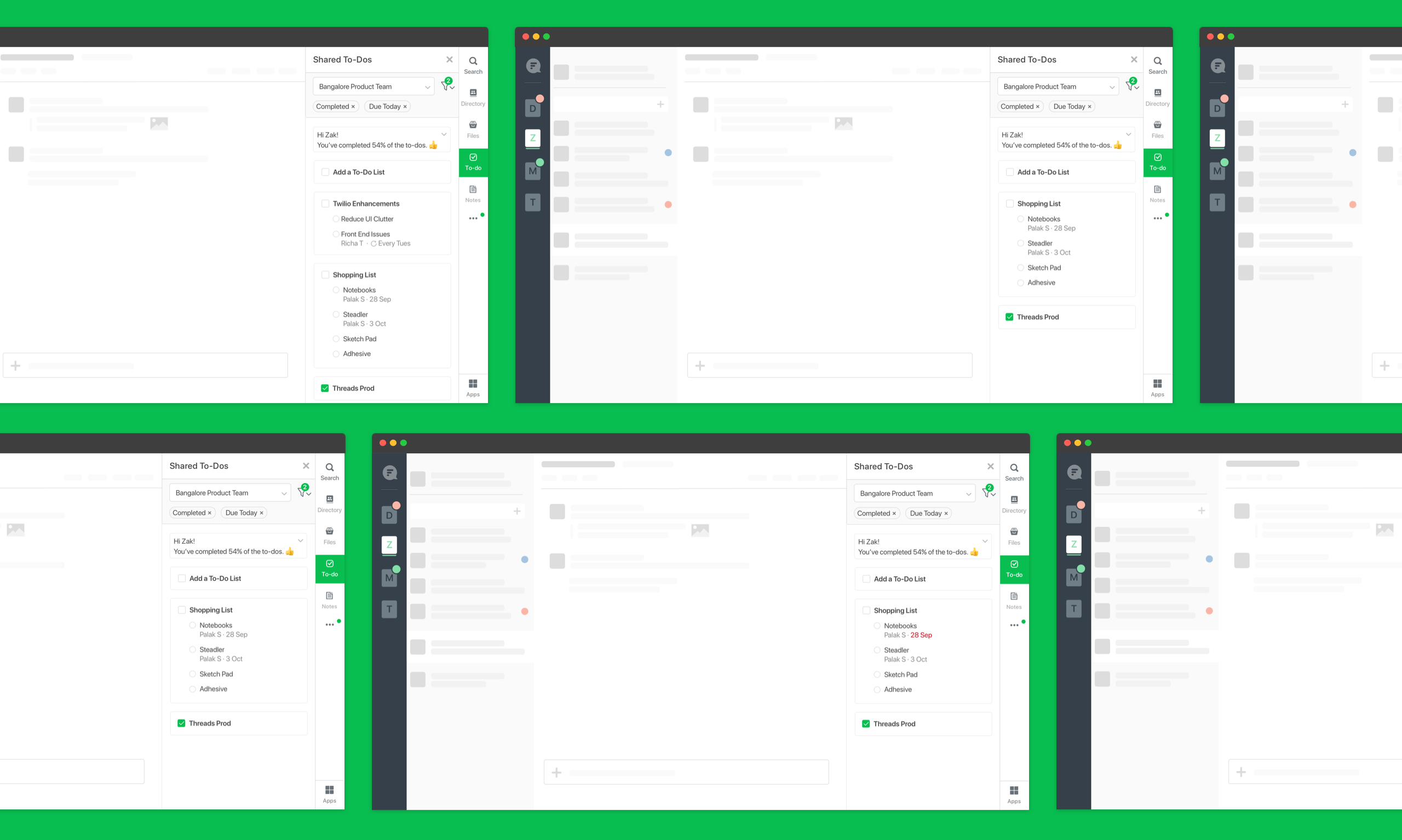
1. In order to enhance the experience of the To-do App, we started with uncluttering the UI. We showed due date whenever it had been assigned. Assignee was showed when assigned to any user. Unnamed lists were removed with no to-dos.
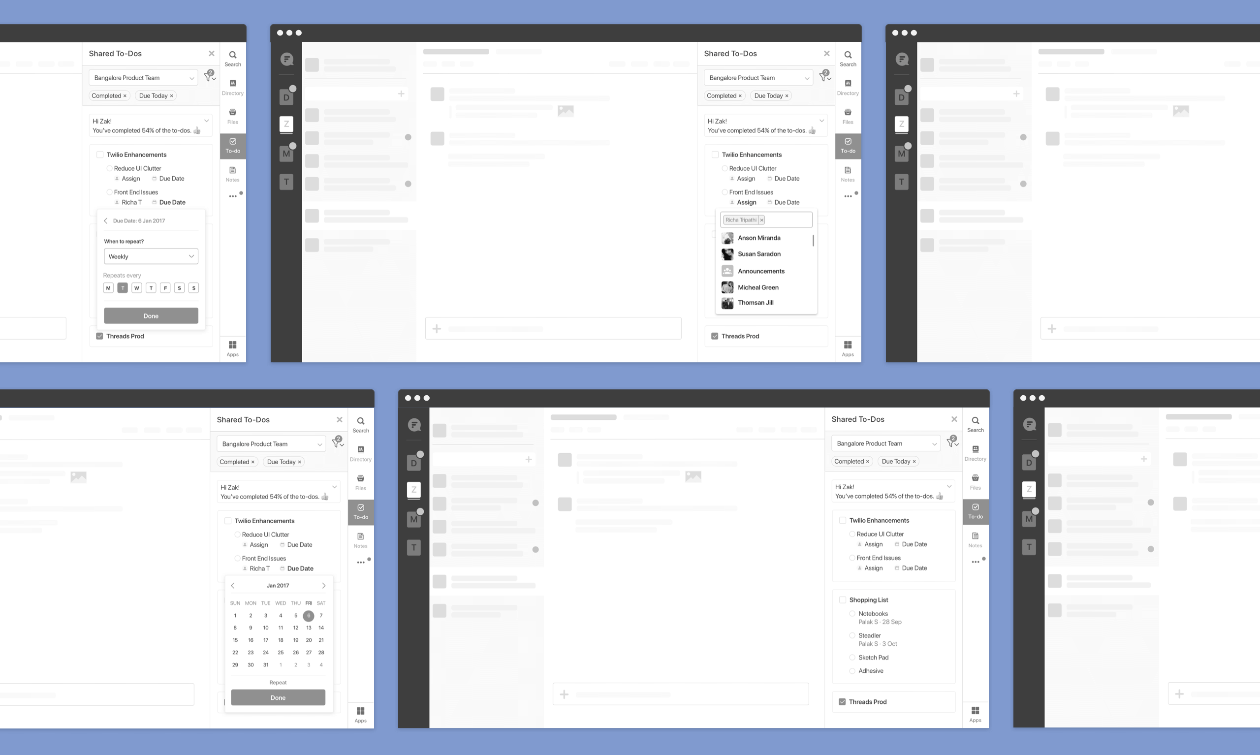
2. Users could set up recurring tasks, add assignee and start date.
3. Users could filter out to-dos based on conversation, due date, overdue tasks, completed tasks and assigned tasks.

High fidelity wireframes were made to resolve the existing problems.
1. Creating tasks was made super simple with Shared To-dos. Users open the app from the app sidebar and set a task for themselves or for the team members. They can even use clickable links as titles when setting tasks.
2. Shared To-dos provide an honest approach to working in a team by letting users assign tasks to team members. The Shared To-dos bot will send a notification to users who create To-dos and users who are assigned tasks.
3. Users could easily choose simple deadlines like today, tomorrow, or next week for their tasks, and get reminded about them by the bot. Or, pick a specific date from the calendar to be reminded.
4. Users could arrange to-dos with a simple drag and drop, and know immediately which task to pick up first.
5. To fire up To-dos in an instance, users can use slash commands to set tasks too. They just need to type ‘/todo’ and get going.
6. With Shared to-dos, users can view and mark tasks as done right within the chat. Makes it easy to get work done even on the go.

To validate the use cases and the improvements, we conducted multiple rounds of user testing with a dozen of participants on functional prototypes. We recorded their responses and compared the data. With each round of testing there was one thing that worked perfectly, we took each nugget that worked right and modified the design to what it is currently.
1. To understand when and why users need to use to-do/task management at work - Uncover use-cases and user stories around when do users need to use something other than Flock
2. To understand the current behaviour of users with task management/to-do apps - How are they currently managing their to-dos/tasks at work. If they use Flock to-dos, how are they using it now?
3. To uncover the pain points in current to-do app - Usability issues, User needs and pain points.
Deriving from the usability test, peer reviews we made the UI design
