Get to the root cause faster
During their entire lifecycle, our customers end up creating a lot of content in the form of saved answers & dashboards. While dashboards provide the ability to organise related data from various inputs in one place and passively monitor for changing conditions, ability to get updates for changes on key metrics and actively manage them was a use case unfulfilled in Thoughtspot.
Business monitoring is essential to a company’s success. Whether you’re improving efficiency, saving costs, planning inventory, or tracking goals, you need to define metrics and monitor them regularly to make progress. Metric monitoring allows user to subscribe to KPIs and automatically get notifications as these metrics change, along with an explanation of the key drivers of that change, so users can still make data-driven decisions.
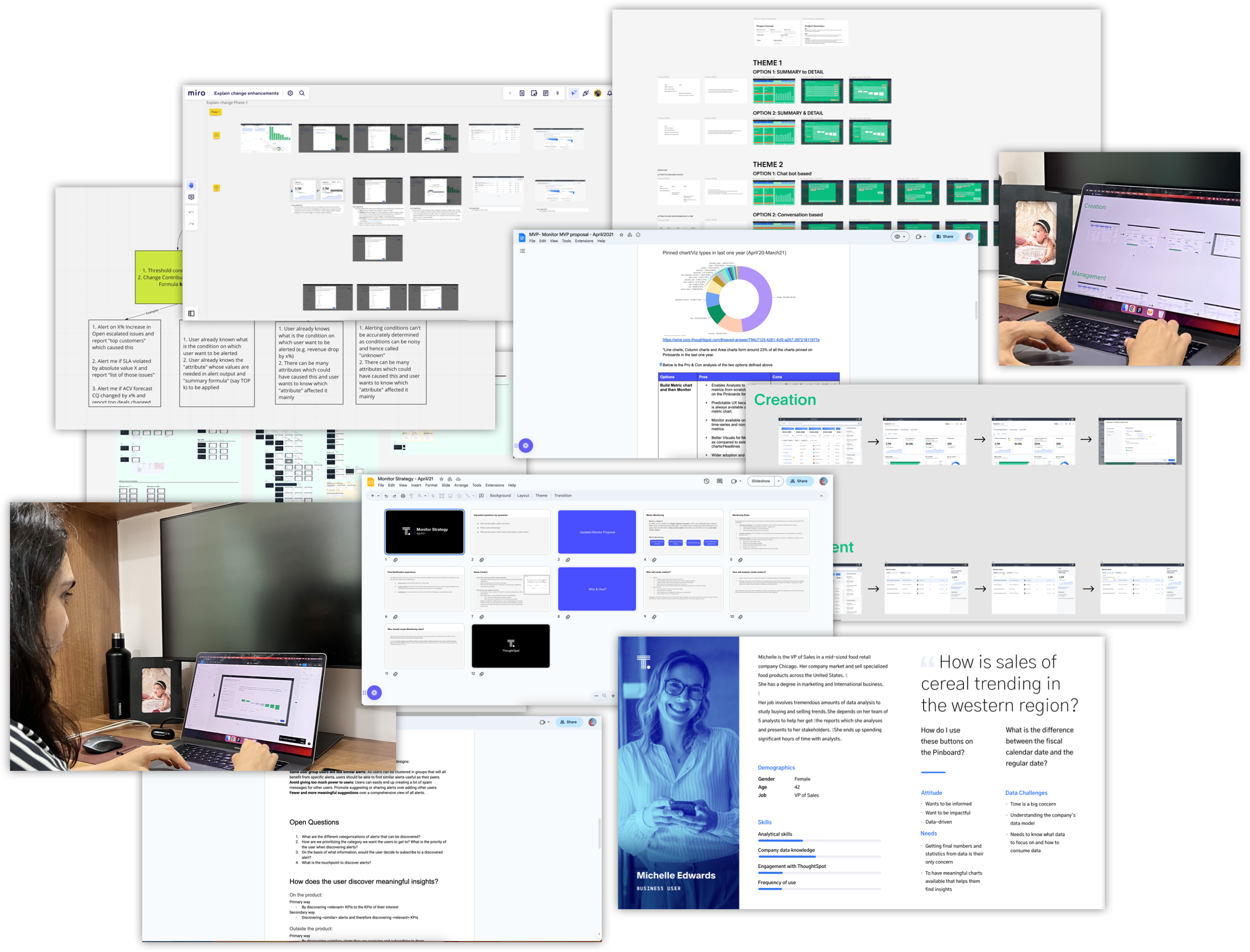
Started from research, conceptualising the flows to creating the visual design, conducting user feedback sessions and communicating the interaction to developers.
Get updates on the movement of key metrics which are changing over time and know which attributes are contributing most to the change.
We used user personas to narrow down to the most important user group whose needs and expectations we needed to address.
The primary persona(>80% of the use case) for this feature is Business users and hence the user experience and user workflows are optimised for business users. The secondary persona for this feature is Analysts(~20% use cases).
Monitor feature would empower the business users by notifying them on the movement of key metrics over time and dig deeper with the ability to figure out what led to the change. This feature will elevate the analysts by giving them the right tools to set up active metric monitoring for the business users.
We identified the core user needs - tracking any metric, get updates on the metric when a certain condition is met or when something unexpected happens, doing change analysis to understand metric movement, sharing the metric with others.
| Key Features | |
|---|---|
Track Metric |
Users want to be up to date with the current value of a metric of interest |
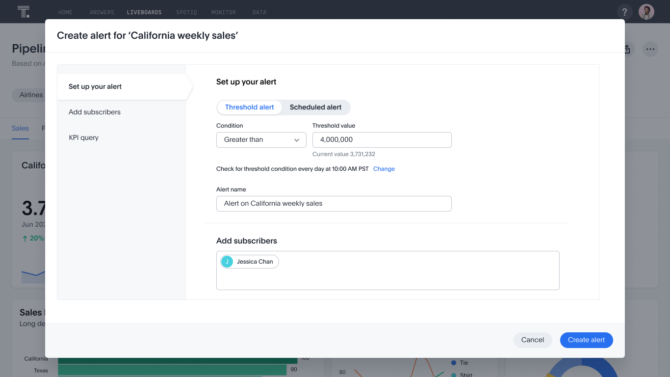
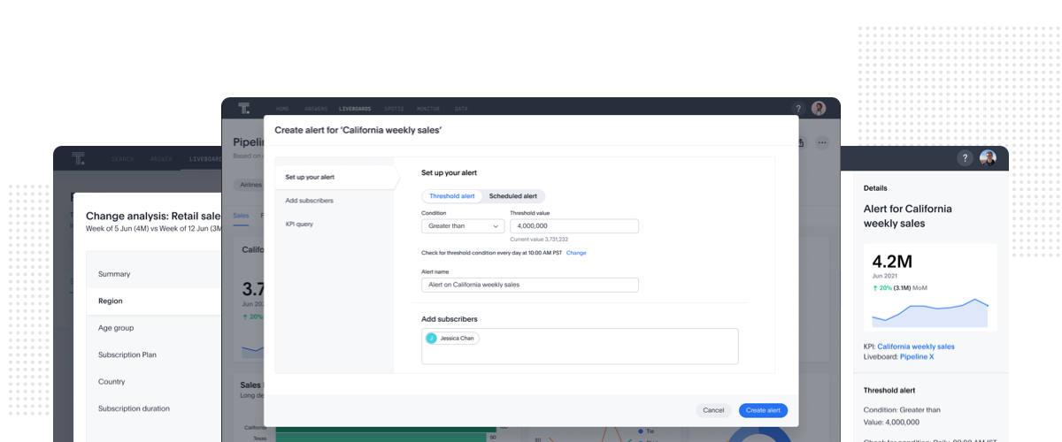
Alert me on Metric |
Users want to get alerted when the metric meets a certain condition or when something unexpected happens |
Explain why Metric moved |
Users want to understand what changed to quickly take action. Users need to validate the hypothesis with data |
Post alert actions |
Users want to take certain actions post receiving the alert. eg. share with other users |
Build an autonomous business analytics engine. Enable our customers to proactively monitor their KPIs and get alerted when something requires their immediate attention and focus only on important things.
Most competitors allow threshold based alerting. Most of the competitors solve for analyst persona. We not only wanted to solve for the core needs, drive stickiness and adoption so we could create a differentiation for Thoughtspot in the market - so we decided to build a richer monitoring experience which involves change analysis and auto alerting.
We had an existing construct of Headlines , but it was a restrictive approach. We considered using Monitor trend chart but it ended up being a very computation heavy approach. So we re-imagined Headlines and introduced KPI charts as a new chart type. It lets users create sparkles and show % change. Having a single-measure chart type helped us overcome the issues other approaches
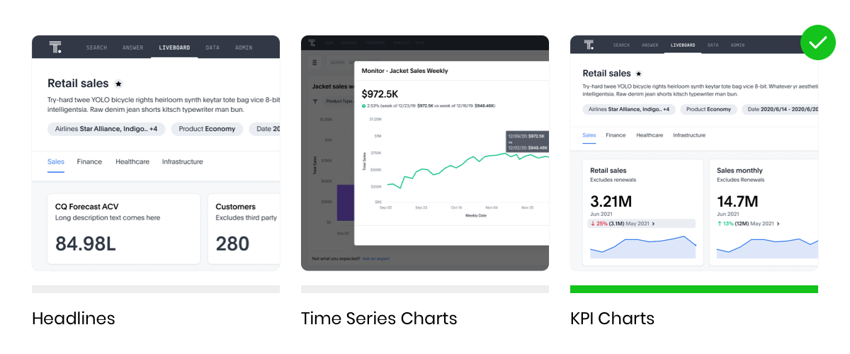
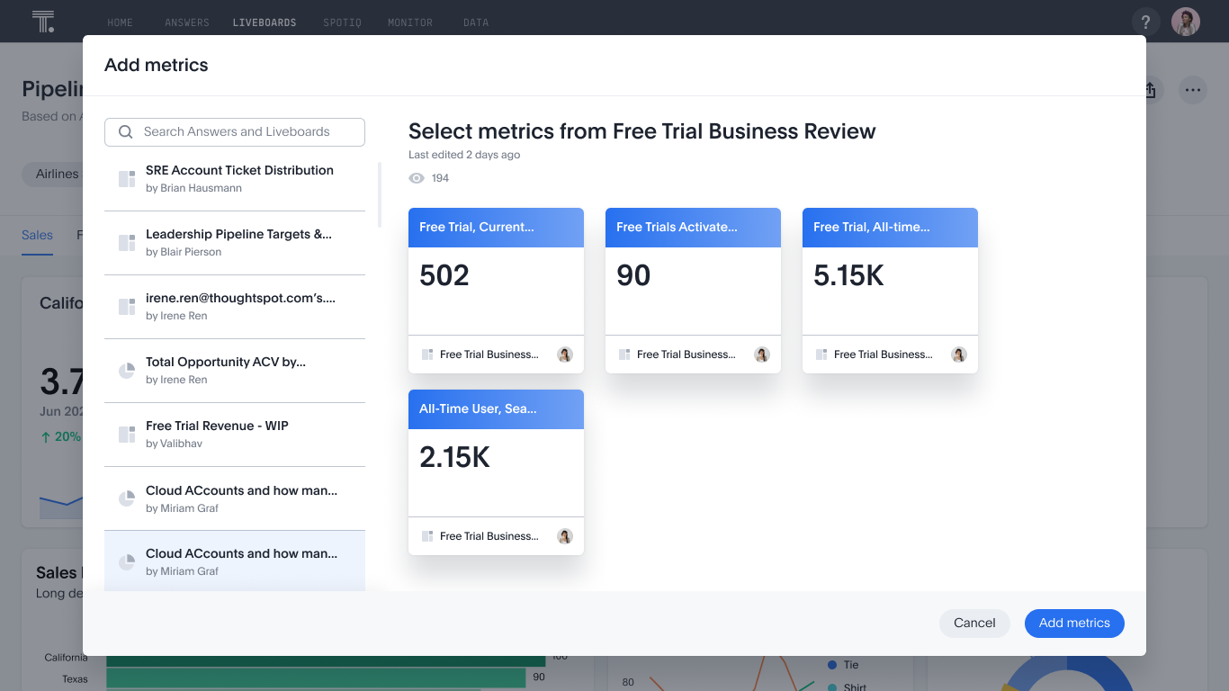
KPI is a new chart type, which requires a unique measure(mandatory) and a continuous time column(non-mandatory) and can be created just like any other visualization from the Sage Search.
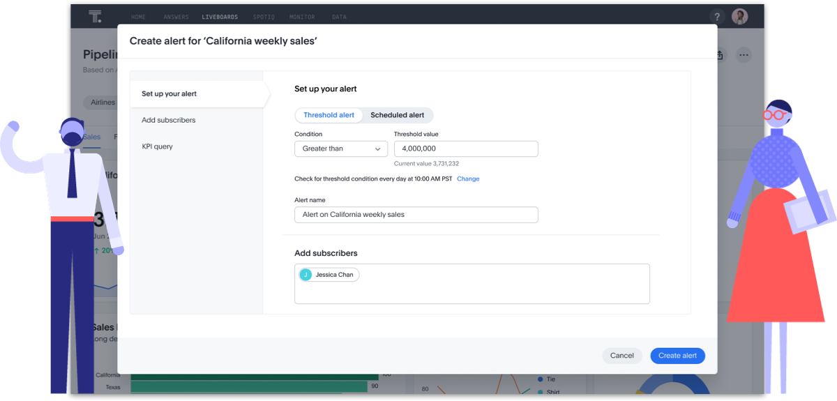
Users can create visualizations of their data’s Key Performance Indicators (KPIs). Users can track the changes in important KPIs in their data. KPI chart can be configured to suit business user case or can be added to homepage watchlist, saved as an answer, pinned to a Liveboard to increase visibility, or create alerts to receive notifications on the changes in the KPI.
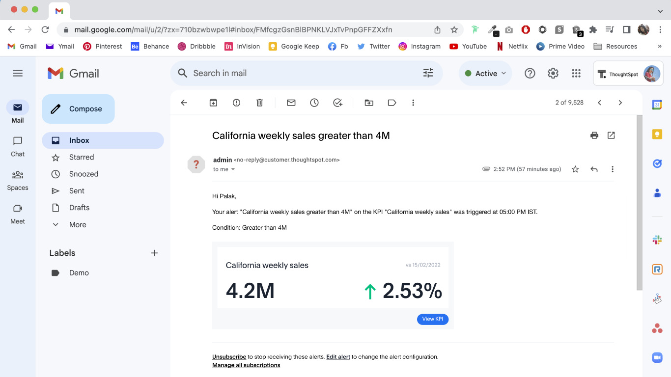
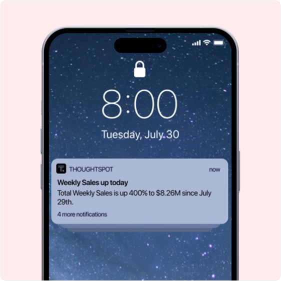
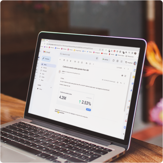
With live KPI charts, users can visualize a single value aggregated measure, how that metric is trending and how much it has changed from the previous time period. Monitor sends notifications when KPI satisfies a certain threshold condition or users can schedule notifications for their KPIs on an hourly, daily, weekly or monthly basis so they never miss a beat on their top metrics even while they are away. These alerts send the latest snapshot of KPI to email inbox and can be customized to whatever frequency works for the user.
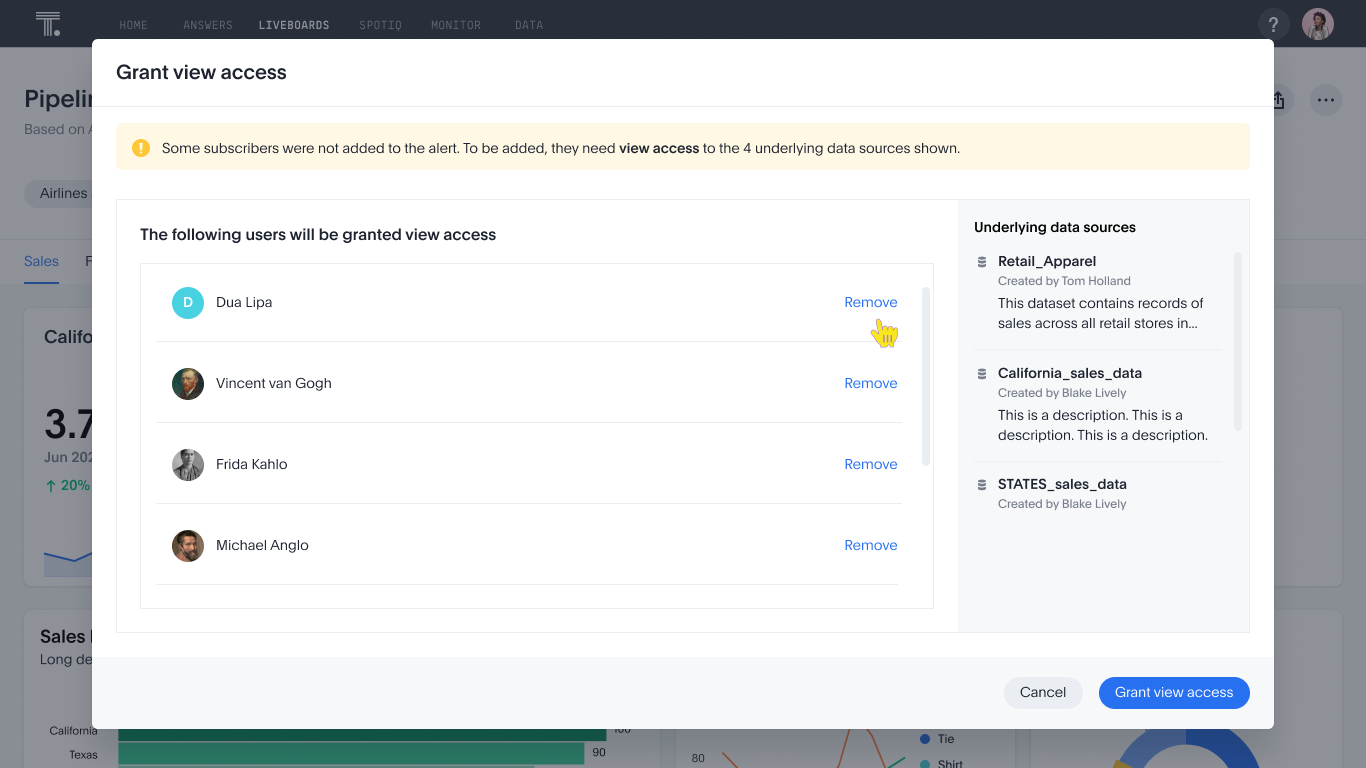
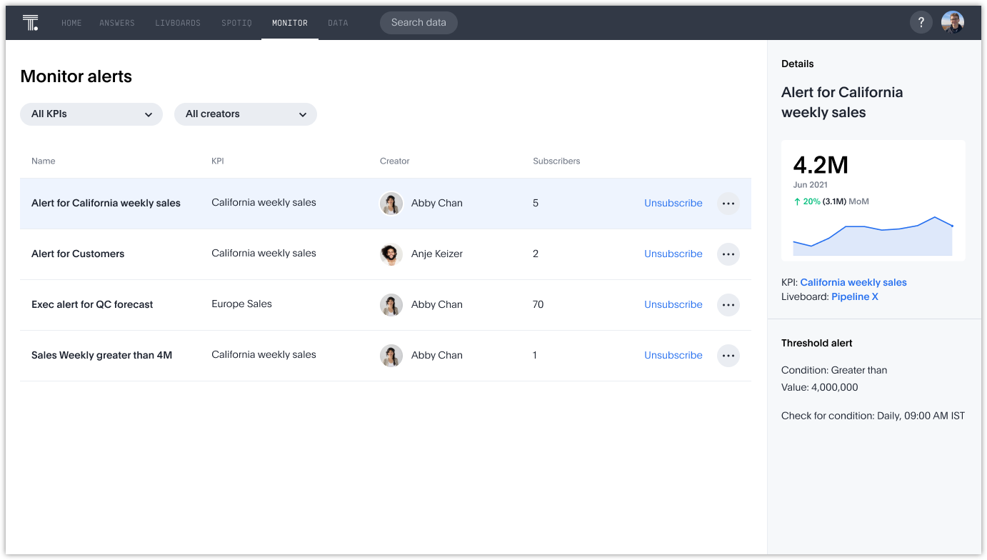
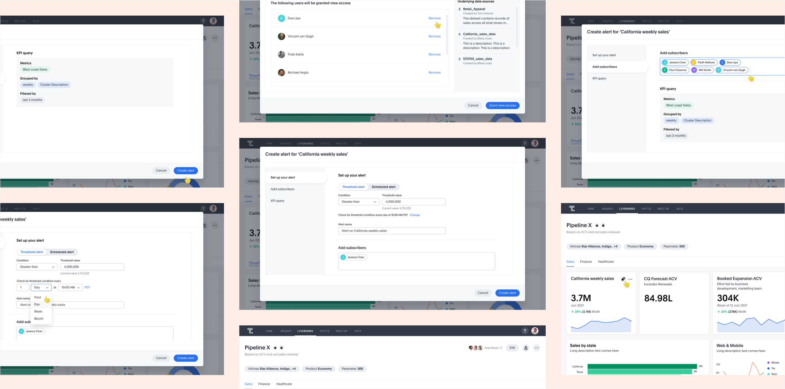
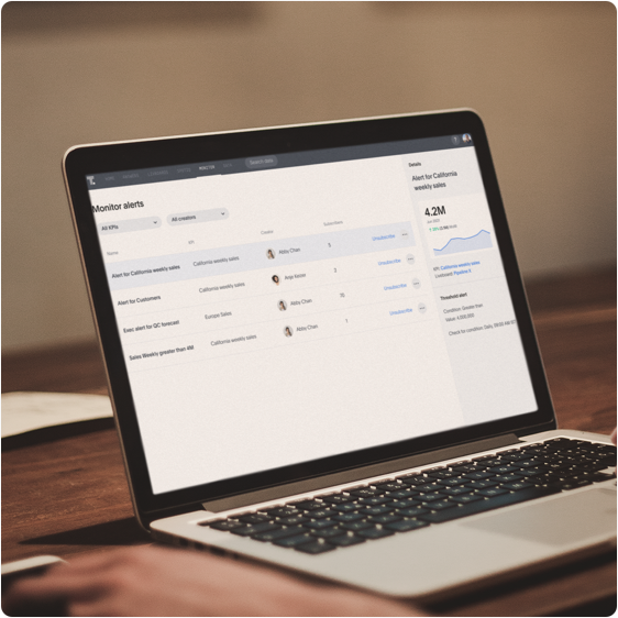
Users can use the monitor tab to manage all the monitor alerts. They can edit, update, delete, add or remove subscribers. Users can filter and sort to pinpoint the relevant insight. User can apply filters to see only rows that satisfy the set parameters. We wanted the business users to be able to ask all questions they have for their data. Users can also see a quick preview upfront of the selected KPI.
Monitor ensures users never miss out on important changes to their KPIs which may require immediate attention. Subscribers get emails with all the important details. There are quick access links that direct the users to the KPI charts on the Thoughtspot platform to analyze further. Users can also choose to modify or unsubscribe from the email notifications.
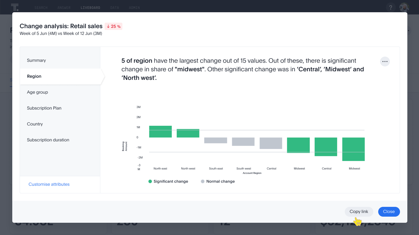
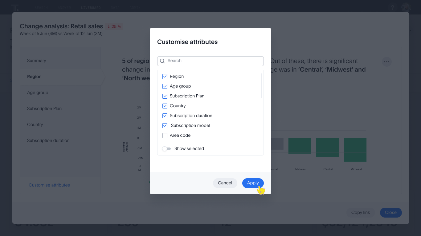
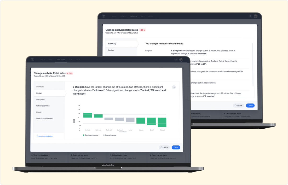
KPI change analysis allows users to drill down into the causes of change in KPIs and customize the insights generated by SpotIQ.
Understanding what caused the changes to your KPIs is often a complex and time-consuming problem for both business users and analysts. Users can run SpotIQ change analysis to identify key drivers behind changes to the KPI metrics. SpotIQ will automatically drill through the underlying attributes to uncover the most relevant reasons that contributed any changes.
We conducted multiple rounds of user testing with dozens of participants on functional prototypes. We recorded their responses and compared the data. With each round of testing, there were aspects that worked perfectly and those that needed iterating. We took each nugget of information, and modified the design to what it is currently.
The study helped us answer questions like:
1. Do users discover the option to start monitoring?
2. Is the setup flow intuitive enough for the users to start monitoring, adding, and removing the people?
3. Is the UI clear for users to understand? e.g. if the latest metric value, trend arrow(up/down), % change, and its baseline time reference clear enough for users to understand and take actions?
4. What are some questions asked by the users around the permission handling model and subscriptions?