UI/UX
ThoughtSpot is a business intelligence and big data analytics platform that helps you explore, analyze and share real-time business analytics data easily. Thoughtspot’s relational search engine can analyze information from any data source.
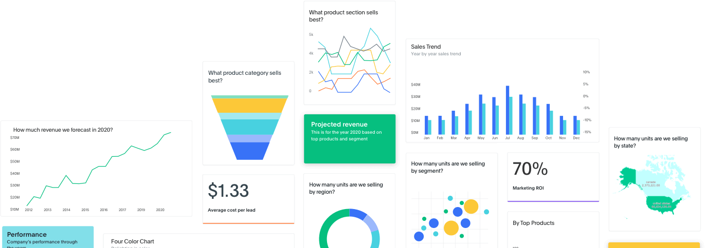
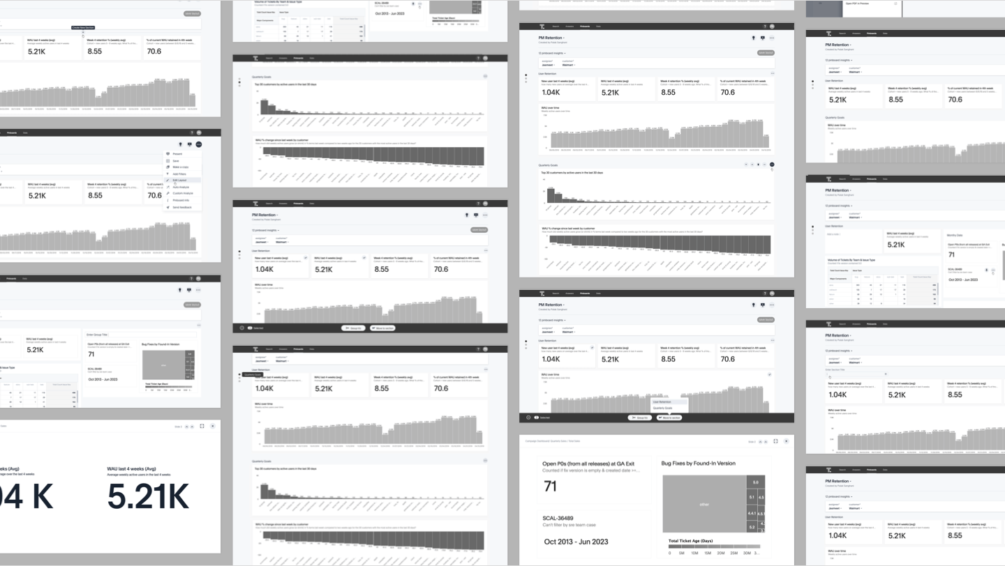
Data is visualized in thoughtspot through dashboards we call Pinboards. Interactive Pinboards help users to extract useful information out of the pinboard, thus making it easy for anyone to drill down, analyze data, present and download reports.
Thoughtspot provides performance at scale, with the ease of use all the data is available at the fingertips. Thoughtspot’s special sauce generates fast answers, internal DB gives great performance with high detail at scale.
Customers need visualizations that intuitively represent their business use case. Meaningful - appropriate labels, units, etc. Customer must feel confident when presenting insights from Thoughtspot in terms of branding, typography and colours
Pinboard layouts allow users to create, interact and tell a story with beautiful visualisations, images, text snippets etc.
Started from research, conceptualising the flows to creating the visual design, conducting user feedback sessions and communicating the interaction to developers.

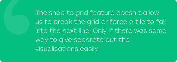
Infinitely extensible pinboards hinder the discovery of existing answers below the visible fold. Lack of detailed context hampers the consumption flow. A better layout functionality can help make pinboards more compelling and engaging and make the product more complete as a BI tool.
We conducted customer and market research to drive our planning phase. The key insights defined the launch version of the product.
There are mainly 3 user personas we wanted to target
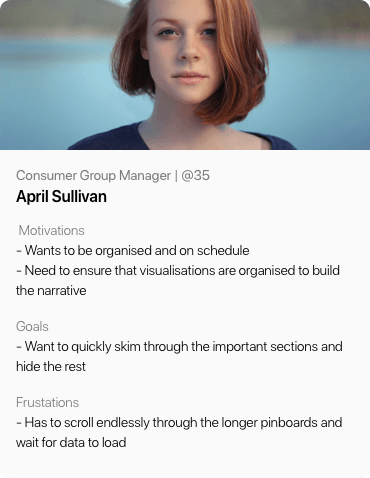
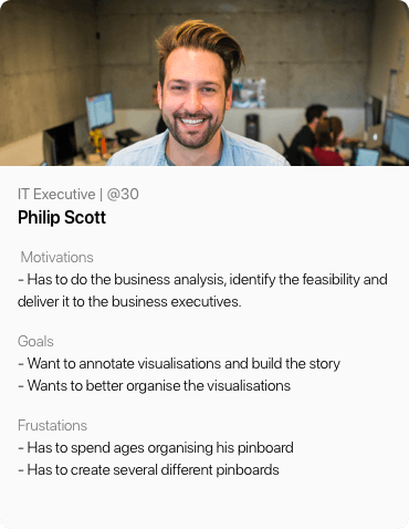
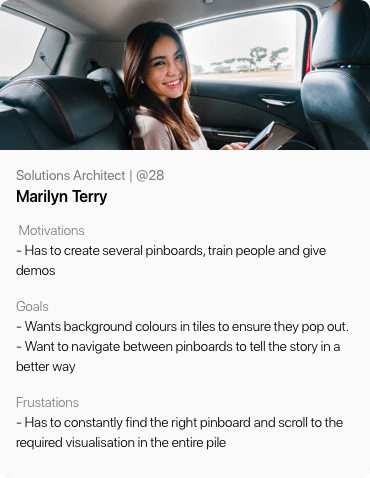
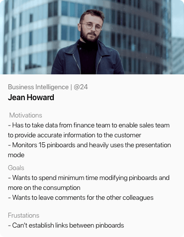
After understanding their actions, feelings, pain points and desired outcomes we went ahead to write the user stories
1. When a creator wants to organise his pinboard into smaller subset of answers grouped together to provide additional context and faster convenient consumption rate
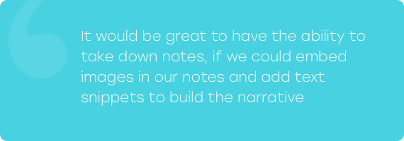
2. When a creator wants to add notes to aid in better storytelling with visually appealing background information. This should help consumers also form better observations
3. When an explorer wants to reach a relevant answer or section faster
In order to provide an effective solution we first tried to understand how users currently address this problem and how do they prefer to share data. We investigated the mental model around how users organize their data.
While trying to bring the benefits of rich text editors to the platform the risk is to disrupt the visual aesthetics of pinboards by giving control to the users
The feature had to be light weight and still not look force fit, learning curve couldn’t be steep.
Insights helped us define our goal
“Design quick & seamless way to set reminders in flock enabling users to set recurring reminders,
reminders for themselves and for others”
Our high level goals were
1. Allow users to create and organize pinboards into different sections, treat the visualisations
like tiles which can be reordered and rearranged.
2. Allow users to add notes with text snippets, images, logos which help build a narrative for the
pinboard.
3. Allow users to navigate between the sections on Pinboards, jump quickly without having to scroll
down to a particular section.
Having defined the area we had to focus on, we moved on to ideation. Starting with competitive and functionality analysis.
We checked other apps and platforms with similar functionality for insights into common patterns to understand user’s mental model - Invision, Marvel, Zeplin, Microsoft PowerPoint etc. and prepared moodboards to explore creative ways to solve the existing problems.
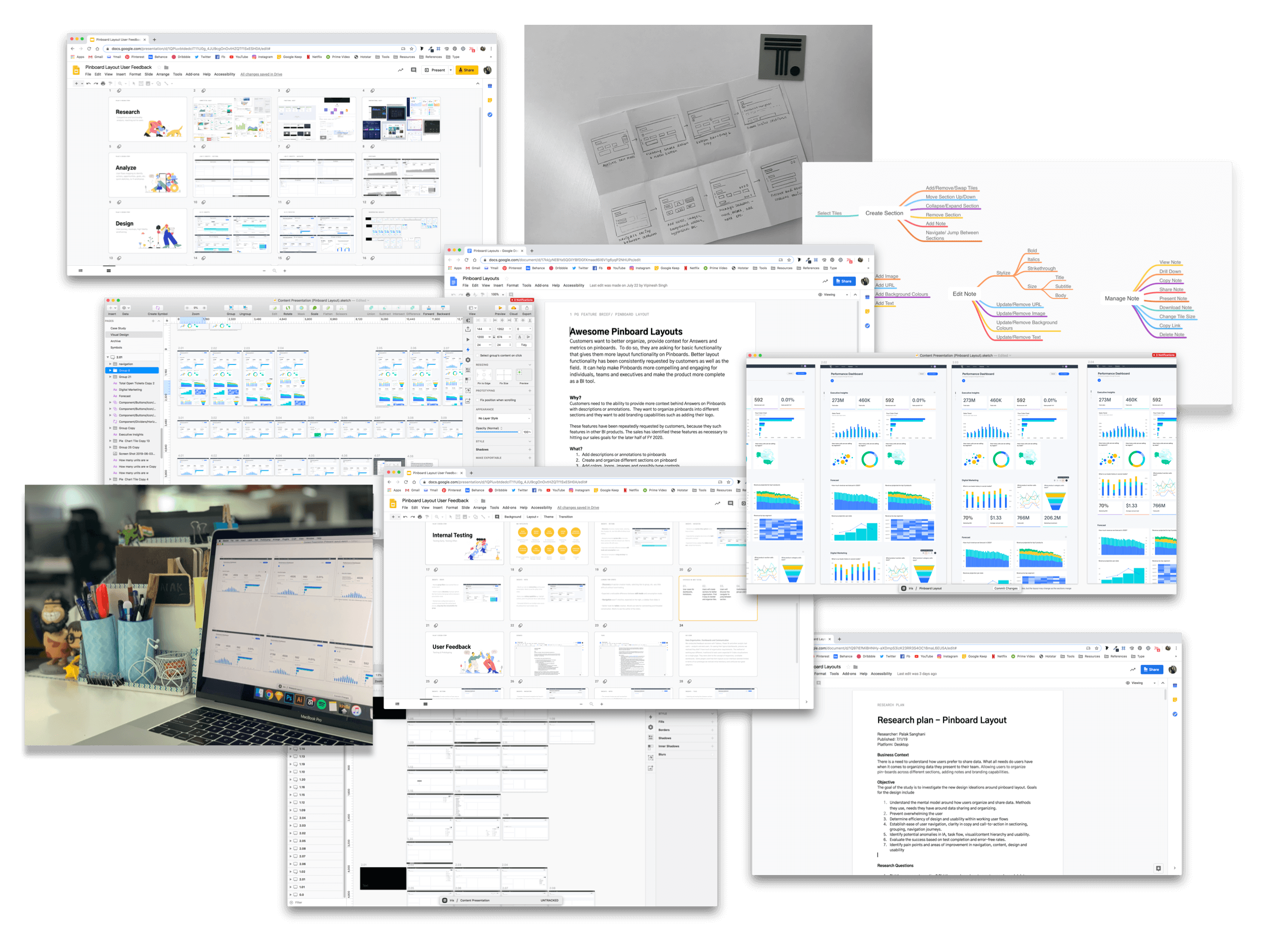
After several brainstorming sessions, throwing ideas around and quick paper sketches we came up with several approaches to solve the existing problems with light weight solutions. Keeping in mind the tech constraints, user pain points and the established mental models we proposed three different approaches.
Visualisations can be divided between different tabs in the same dashboard
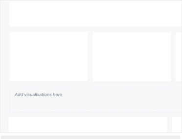
Users can drag and drop visualisations into an empty container to define a section
Users can draw a horizontal divider between tiles to separate sections
| Tabs | Container | Horizontal | |
|---|---|---|---|
| Pros | Minimum learning
curve, users are used to the model of switching between tabs. |
Allows to easily compare two sections, resizes as per the visualisation tiles. |
This wouldn’t be a big change for users to get used to, intuitive |
| Cons | User has to jump
between tabs. |
Visualisation tile size further decreases, may not work in responsive layout |
Cannot compare two sections, visualisations are pushed further below the fold |
| Mitigations | Can behave as an umbrella entity that clubs together pinboards |
Creating and updating is easy, can use container format with horizontal separation |
Allow easy rearranging of viz tiles, multi select, collapsing and reordering of sections to solve for all existing requirements. |
High fidelity wireframes were made to resolve the existing problems and to weigh the pros and cons of all the different models. Drawing inspiration from the insights we explored UX journeys for the promising directions to cater to the problems at hand.
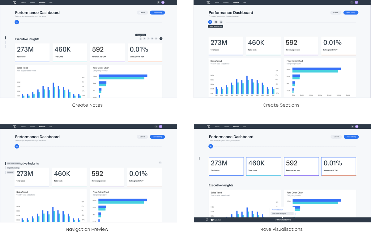
Edit Mode
-We separated the consumption and the creation flow to ensure the best experience for both use
cases. One has to activate the edit layout mode to tweak the layout of the pinboard. Edit mode is
focused on tweaking the layout so hiding all distractions and additional drill down options on the
visualisations.
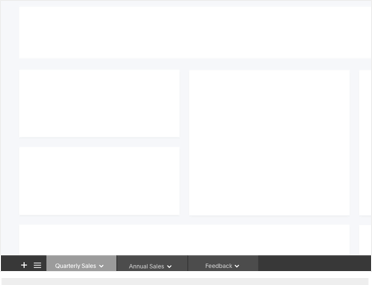
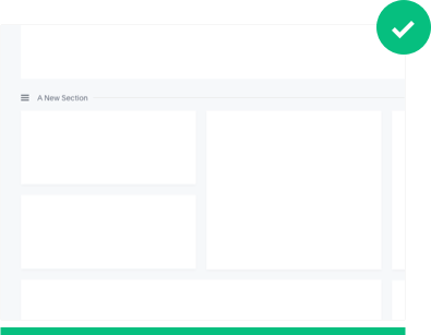
Sections
-Once in edit mode, users can use the horizontal gutter space between visualisations to create new
sections. Sections can be moved up/down, collapsed/expanded and deleted.
-Users can move visualisation tiles between sections as well as within sections. Along with the drag
and drop behaviour, we introduced a bottom icon tray that helps in quick moving of tiles between
sections.
Navigation
-As pinboards get longer there arises a need to jump between sections easily. We added subtle
horizontal navigator to help users jump between sections.
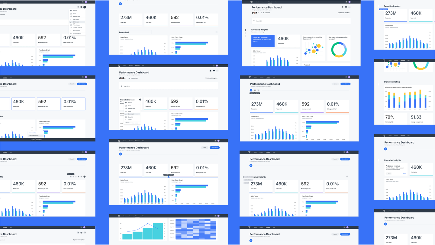
To validate the use cases and the improvements, we conducted multiple rounds of user testing with a dozen of participants on functional prototypes. We recorded their responses and compared the data. With each round of testing there was one thing that worked perfectly, we took each nugget that worked right and modified the design to what it is currently.
Objective
The goal of the study is to investigate the new design ideations around pinboard layout. Goals for
the design include
We derived the following insights from moderated user studies
Create Section
-Hovering interaction to create a new section was hard for users to discover. We made it prominent
and decided to add a floating action add button to the top of the pinboard to act as a clear call to
action when one activates the edit layout mode. Thus, facilitating better discovery and quick
actions.
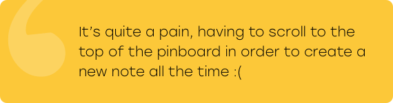
Notes
-Hook to create notes was at the top of the pinboard so users were forced to scroll to the top every
time they wished to create a note, so we added a section level option to create new notes.
Navigation
-One had to hover over a particular horizontal line to see section titles, after 2-3 sections users
forgot the sequence. To give an overall picture we started showing all section titles on hover along
the horizontal gutter space.
Micro interactions
-We experimented with tool-tips, icons and micro-interactions to gauge what the users responded best
to. We kept tweaking the micro copy till we felt we were there!
Deriving from the usability test, peer reviews we made the UI design
- User feedback sessions often reveal results right opposite to the assumptions.
- We had to focus on localisation of the Labels, tooltips and CTA.
Thoughtful conclusions and reflection.
Metrics to track
Hard Metrics
1. # of Section actions - creation, edit, delete
2. # of answers moved to different sections Individually moved Moved in bulk
3. # of note actions - Notes created, edited, deleted
4. # of clicks on the section nav bar Above metrics are at a WoW timeframe for last 4 calendar
weeks.
Soft Metrics
1. Consumer events (viewing pinboards or answers) on pinboards with sections vs. pinboards without
sections (bucketed by number of sections)
2. Explorer events (add column to search from left panel, add filter to answer, sage search, enlite
search, edit chart config) on objects from pinboards with sections vs. pinboards without sections
(bucketed by number of sections